
- 公開日:
パワーポイントのグラフの作成/編集方法
パワーポイントで数値を示したプレゼンテーションをしたい時、グラフは欠かせない要素となります。
パワーポイントにはグラフ機能が備わっており、折れ線グラフや円グラフなど様々な種類のグラフを作成することができます。また、エクセルで作成したグラフをパワーポイントのスライドに挿入することもできます。
説得力のある効果的なプレゼンをする時にはマストとなるグラフの作り方をこの機会にマスターしましょう。
様々な種類のグラフの作り方(挿入方法)
棒グラフの作り方
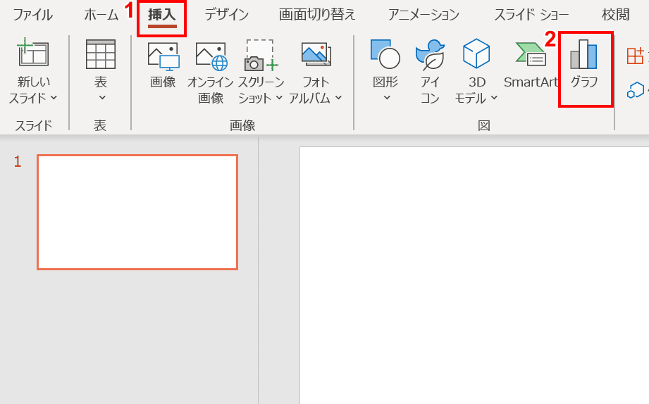
①リボンの【挿入】タブ、②【グラフ】の順に選択します。
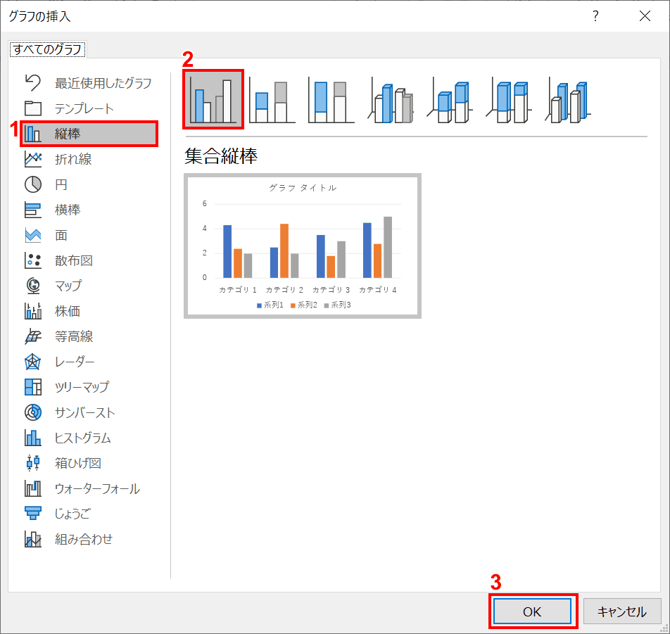
「グラフの挿入」ダイアログボックスが表示されました。①【縦棒】、②【任意のグラフ】、③【OK】ボタンの順に押します。今回は「集合縦棒」を選択しました。
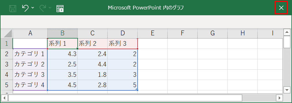
「Microsoft PowerPoint内のグラフ」ウィンドウが表示されます。グラフに表示したい【任意の値】を入力し、【×】を押します。
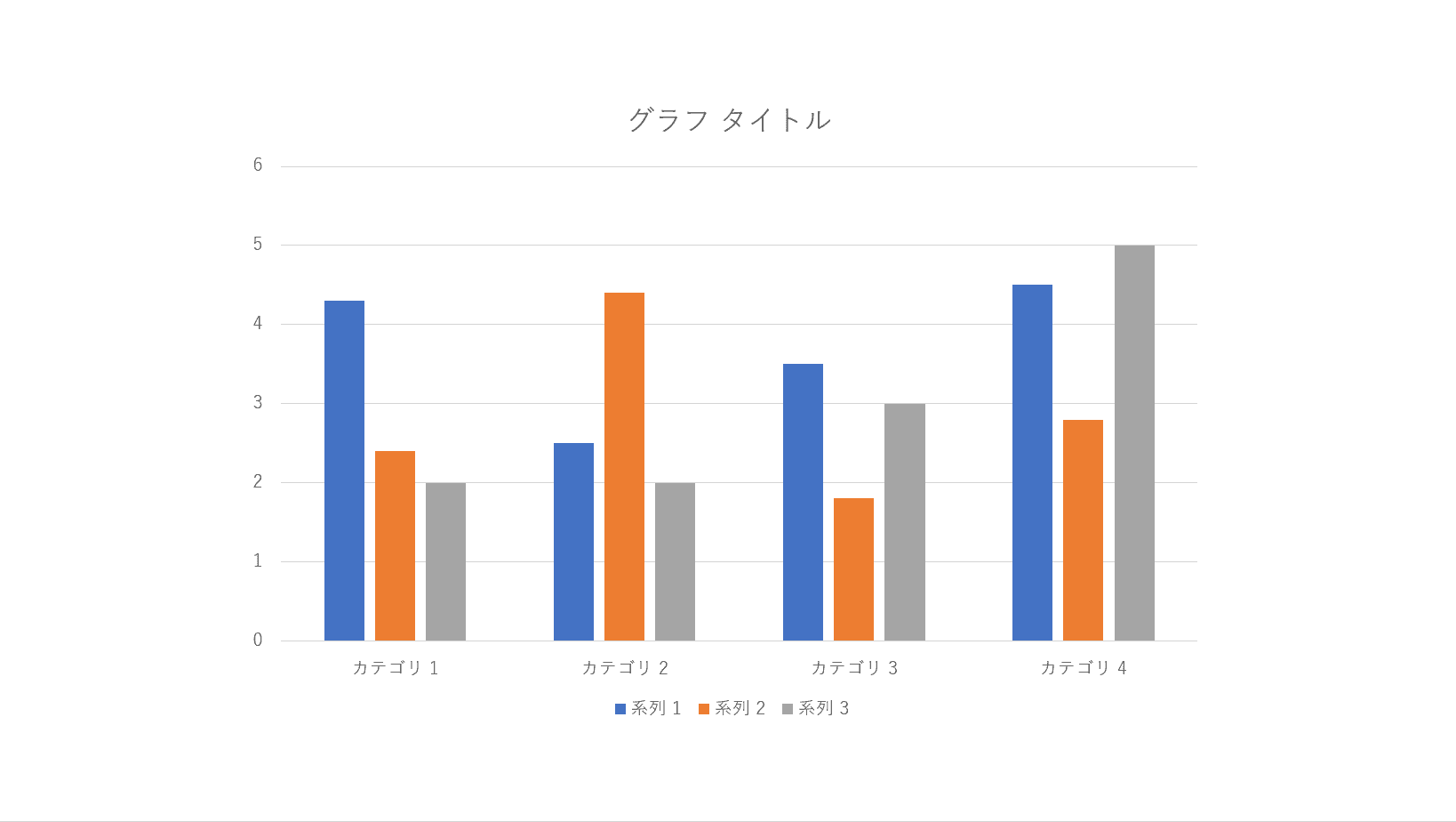
グラフの挿入が完了しました。
折れ線グラフの作り方
①リボンの【挿入】タブ、②【グラフ】の順に選択します。
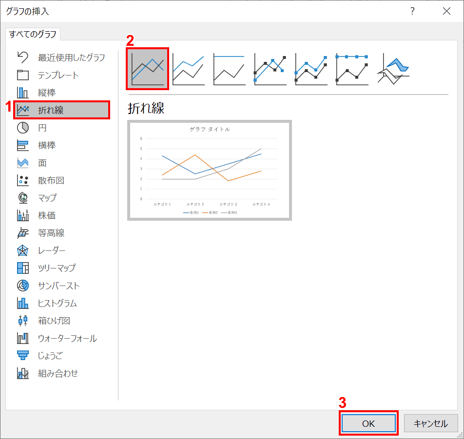
「グラフの挿入」ダイアログボックスが表示されました。①【折れ線】、②【任意のグラフ】、③【OK】ボタンの順に押します。今回は「折れ線」を選択しました。
「Microsoft PowerPoint内のグラフ」ウィンドウが表示されます。グラフに表示したい【任意の値】を入力し、【×】を押します。
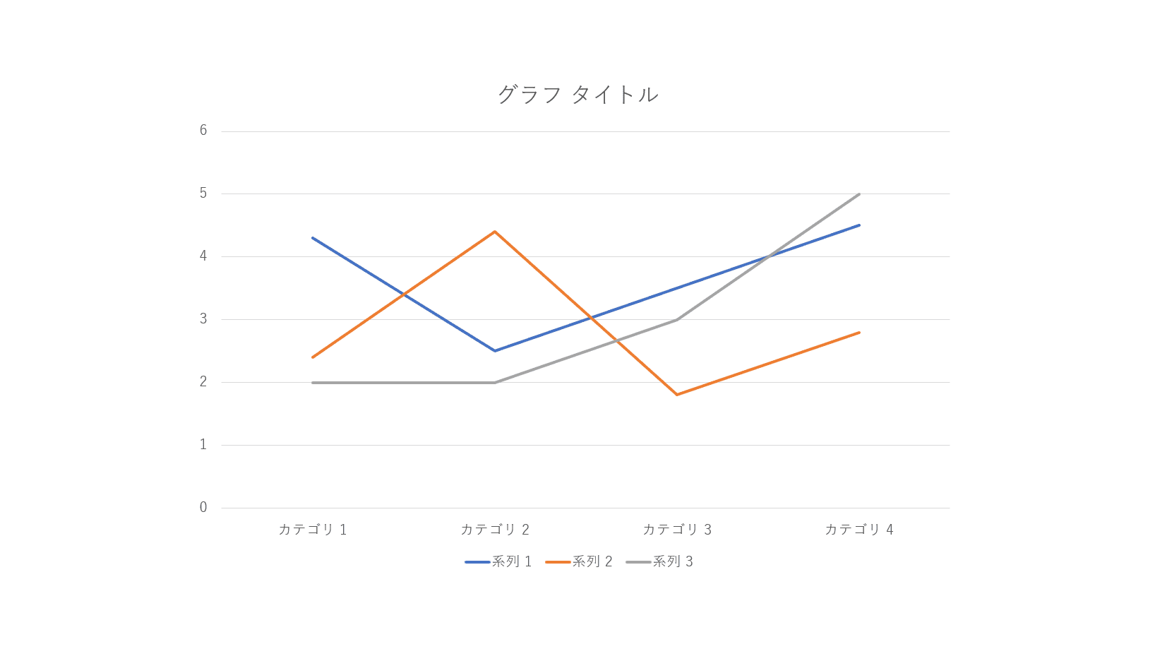
グラフの挿入が完了しました。
円グラフの作り方
①リボンの【挿入】タブ、②【グラフ】の順に選択します。
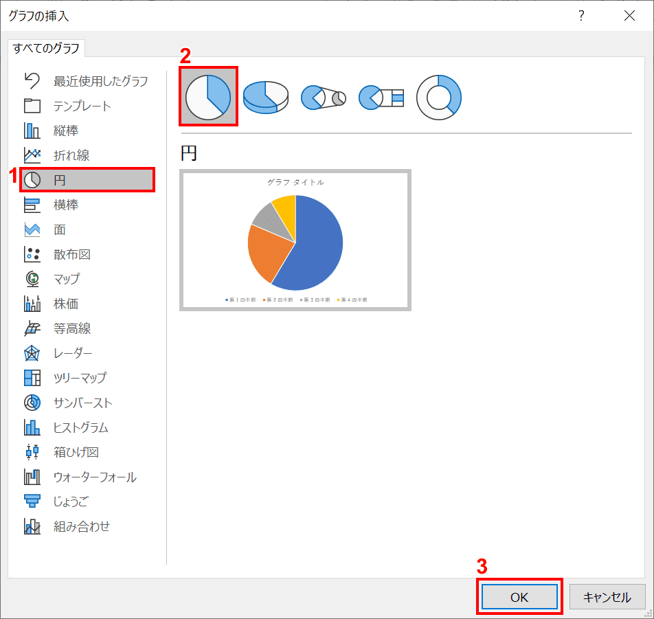
「グラフの挿入」ウィンドウが表示されました。①【円】、②【任意のグラフ】、③【OK】ボタンの順に押します。今回は「円」を選択しました。
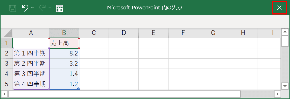
「Microsoft PowerPoint内のグラフ」ウィンドウが表示されます。グラフに表示したい【任意の値】を入力し、【×】を押します。
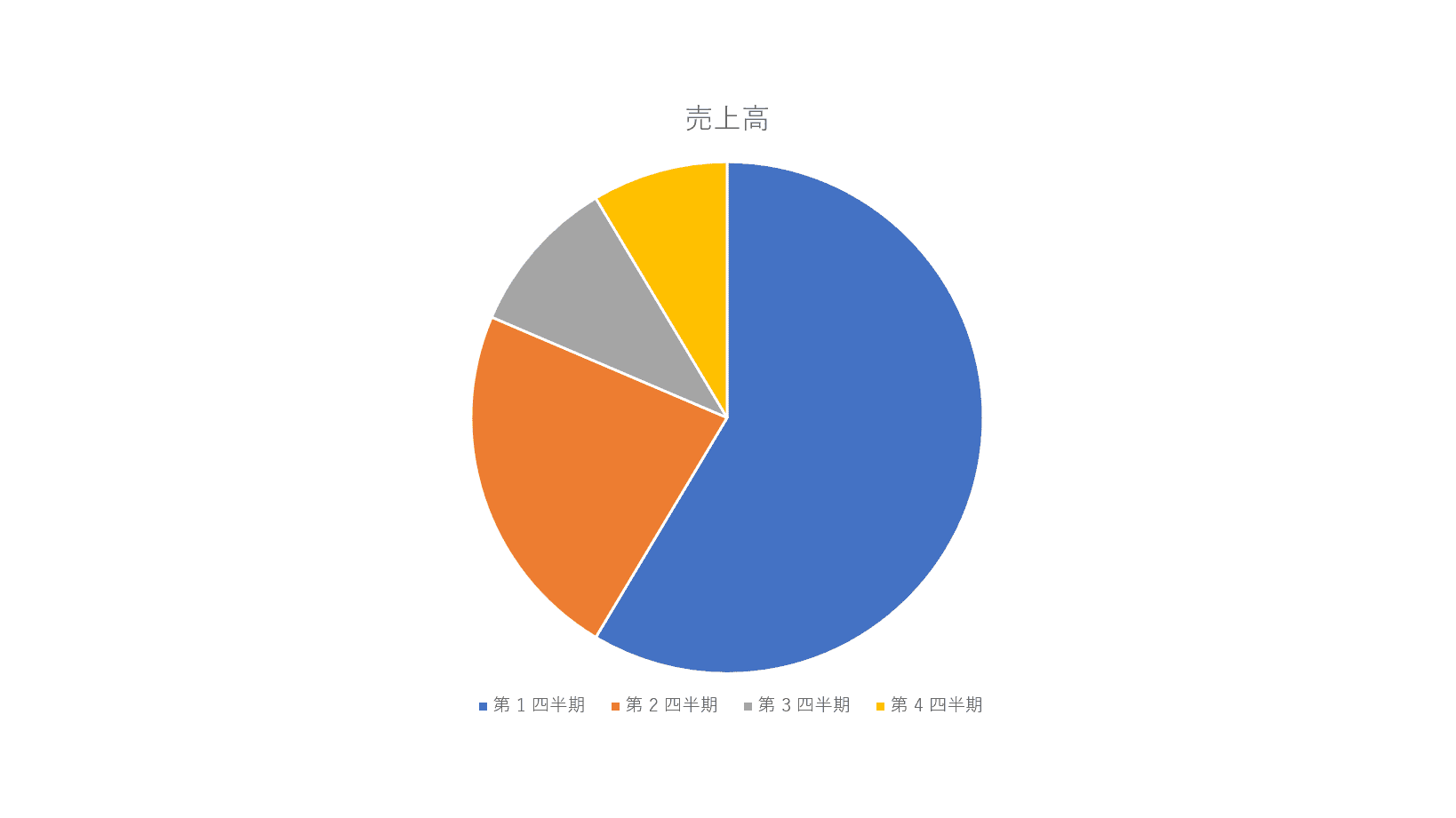
グラフの挿入が完了しました。
2軸の複合グラフの作り方
①リボンの【挿入】タブ、②【グラフ】の順に選択します。
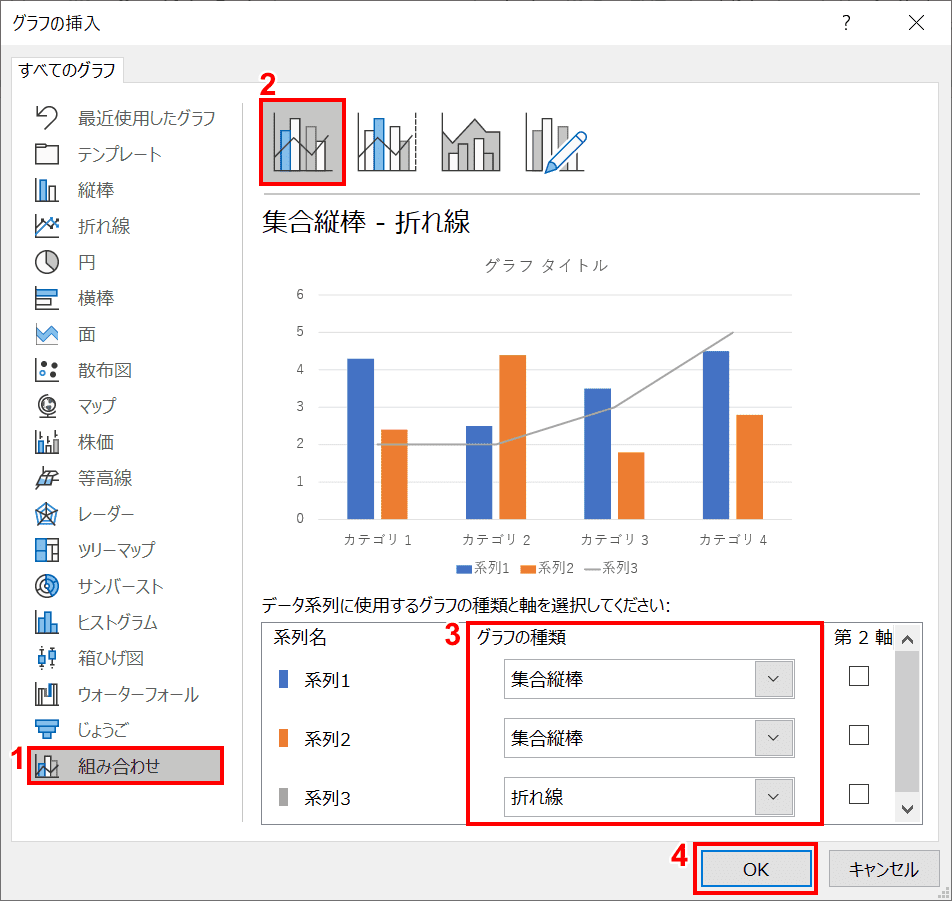
「グラフの挿入」ダイアログボックスが表示されました。①【組み合わせ】、②【任意のグラフ】(今回は「集合縦棒 - 折れ線」を選択しました。)、③【グラフの種類】を選択し、(今回は「系列1」と「系列2」を「集合縦棒」、「系列3」を「折れ線」にしました。)④【OK】ボタンの順に押します。
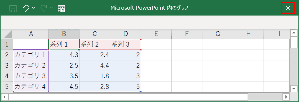
「Microsoft PowerPoint内のグラフ」ウィンドウが表示されます。グラフに表示したい【任意の値】を入力し、【×】を押します。
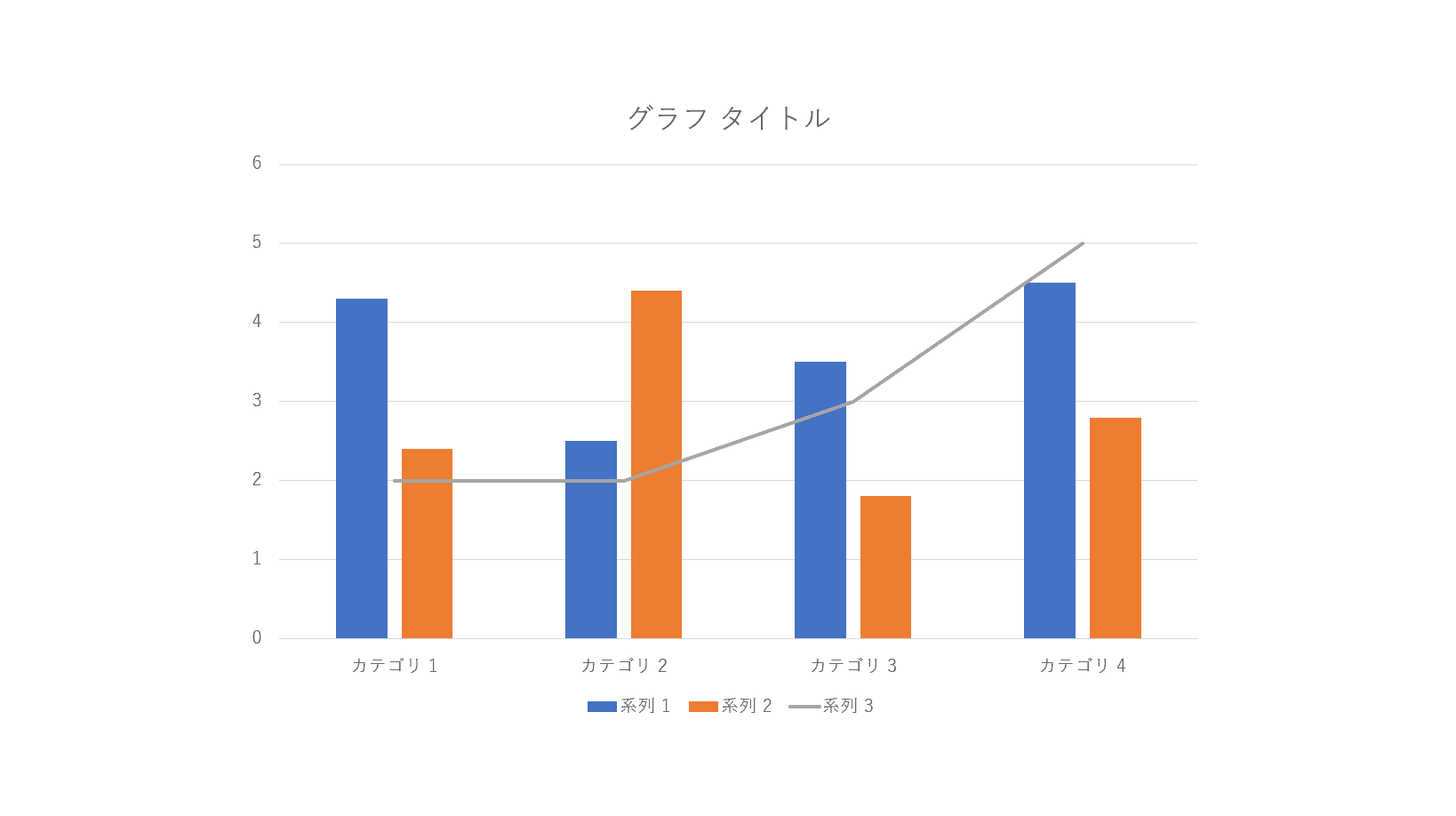
グラフの挿入が完了しました。
グラフの編集方法
データの編集
パワーポイント画面上で編集する
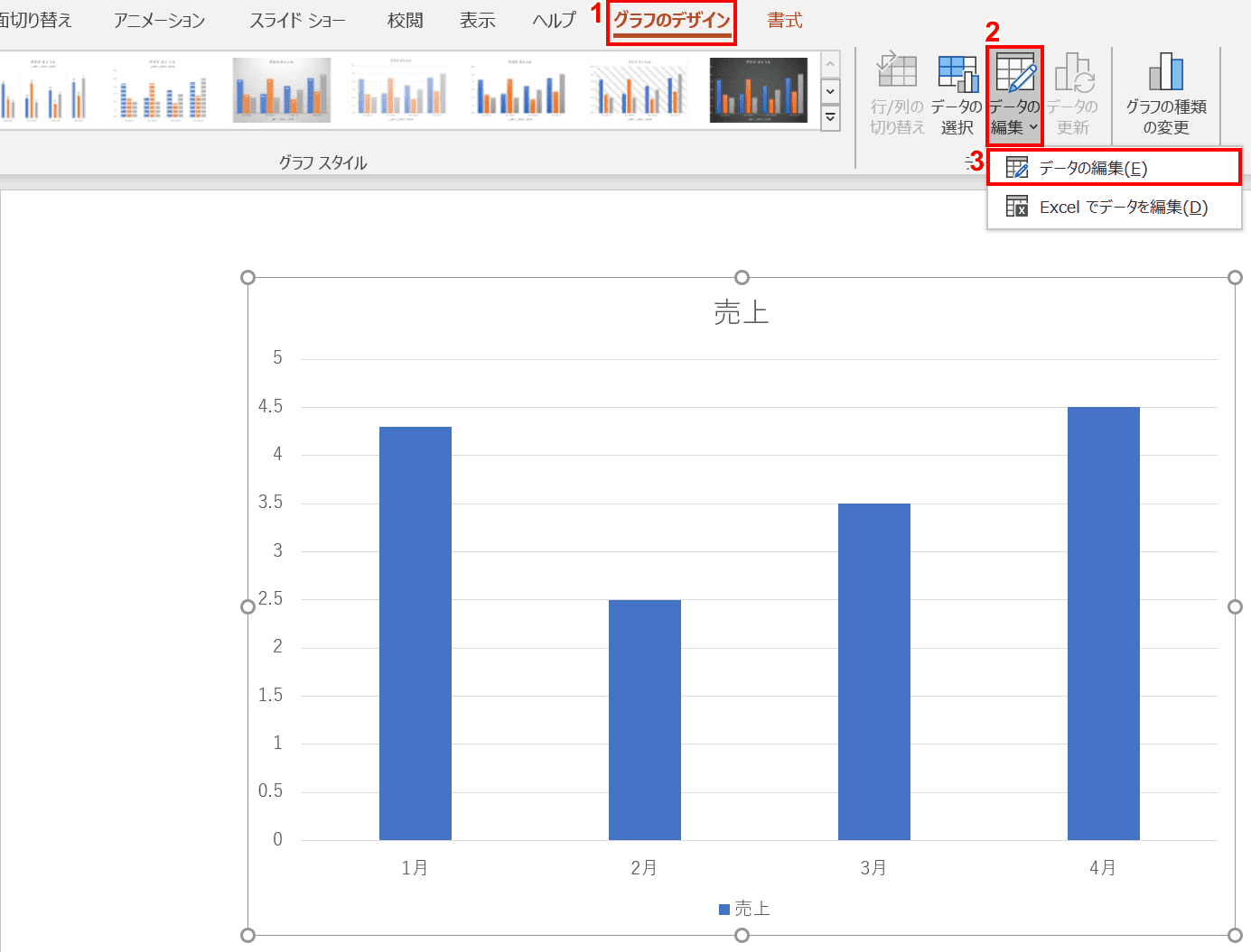
グラフを選択し、①リボンの【グラフのデザイン】タブ、②【データの編集】、③【データの編集】の順に選択します。
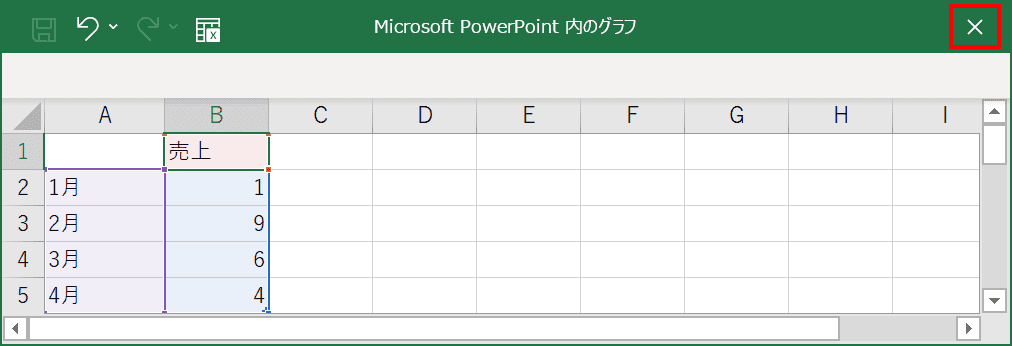
「Microsoft PowerPoint内のグラフ」ウィンドウが表示されます。グラフに表示したい【任意の値】を入力し、【×】を押します。
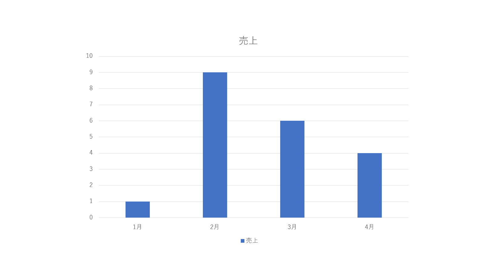
編集が完了しました。
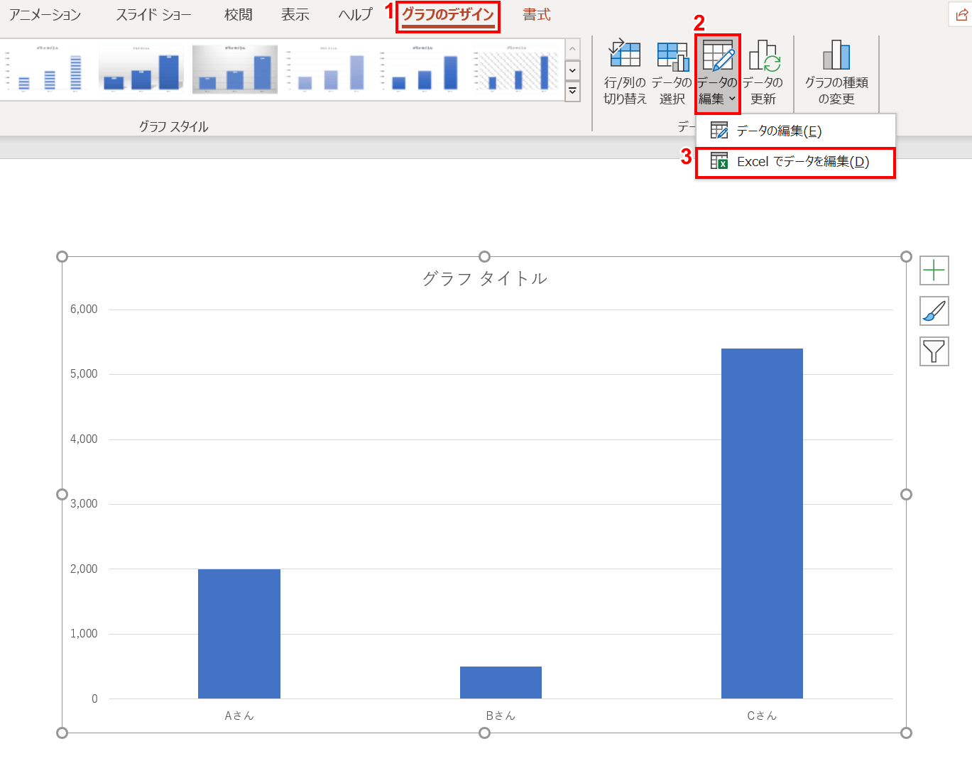
エクセル画面上で編集する
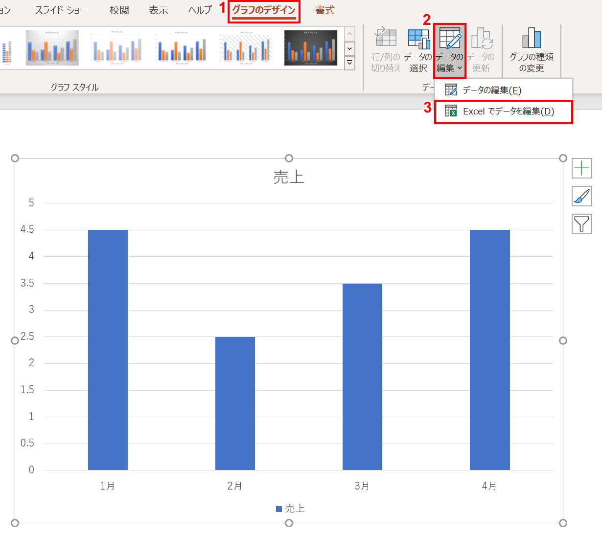
グラフを選択し、①リボンの【グラフのデザイン】タブ、②【データの編集】、③【Excelでデータを編集】の順に選択します。

エクセルの画面が表示されます。グラフに表示したい【任意の値】を入力し、【×】を押します。
編集が完了しました。
凡例を表示する
このグラフに凡例を表示します。
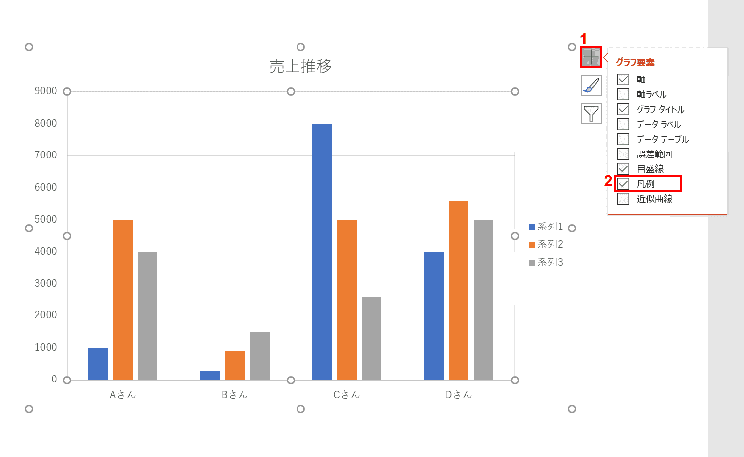
グラフを選択し、①グラフ右上の【+】ボタンを押し、②「グラフ要素」の「凡例」に【チェック】を入れます。

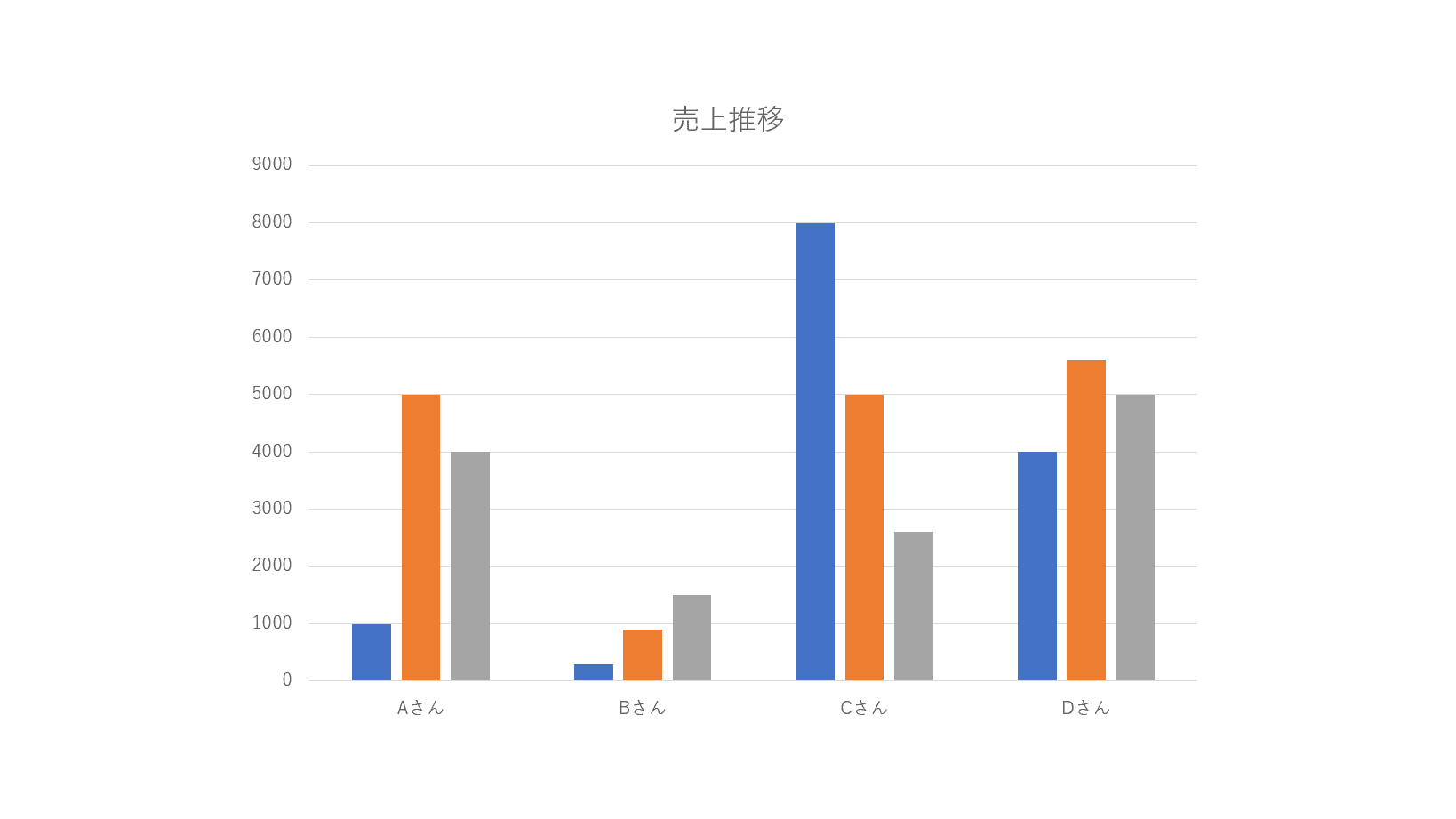
グラフの中に「系列1、系列2、系列3」と凡例が表示されました。
凡例の順序を並び替える
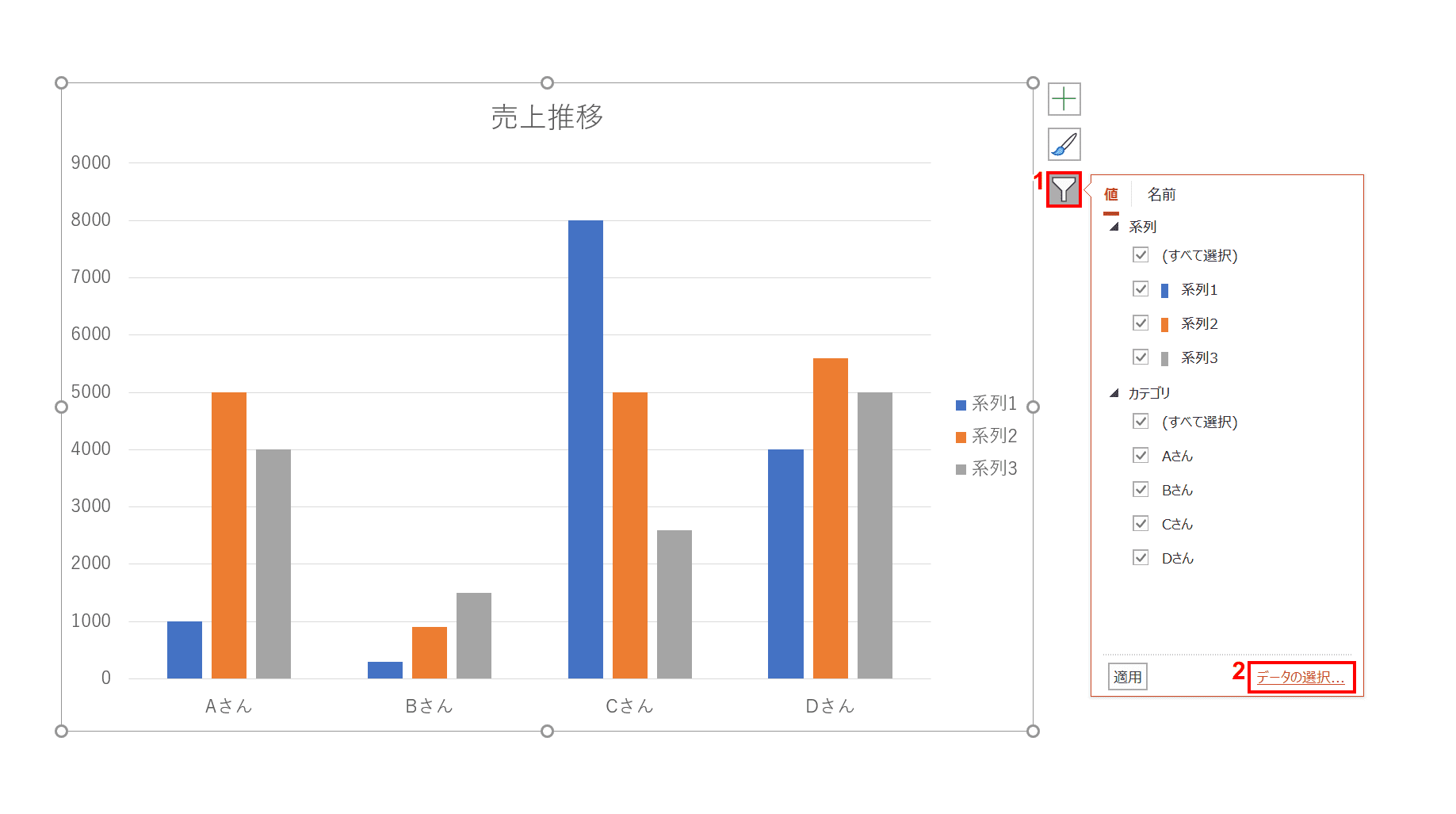
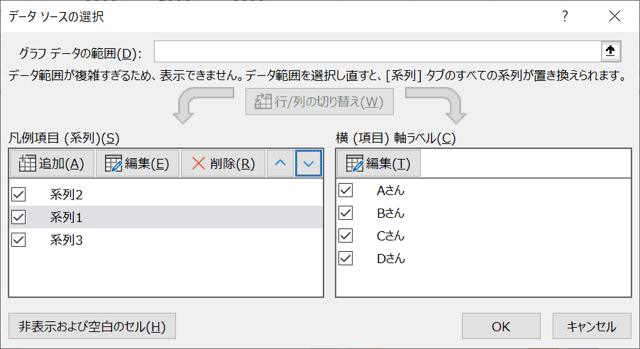
凡例の順番を並び替えます。グラフを選択し、グラフ右上の①【フィルター】ボタン、②【データの選択】リンクの順に選択します。
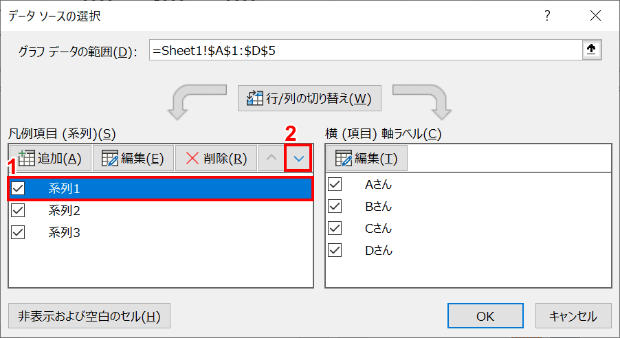
「データソースの選択」ダイアログボックスが表示されます。①【系列1】を選択し、②【▼】ボタンを押し、順番を変更します。
「系列1」が2番目に移動しました。
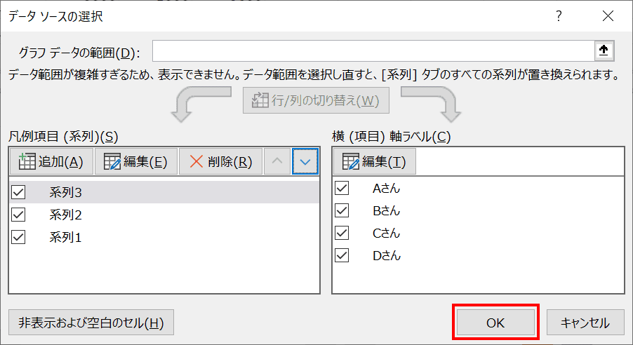
同じように「系列2」と「系列3」も矢印ボタンで操作します。今回は上から「系列3、系列2、系列1」のようにします。並び替えが完了したら下部の【OK】ボタンを押します。
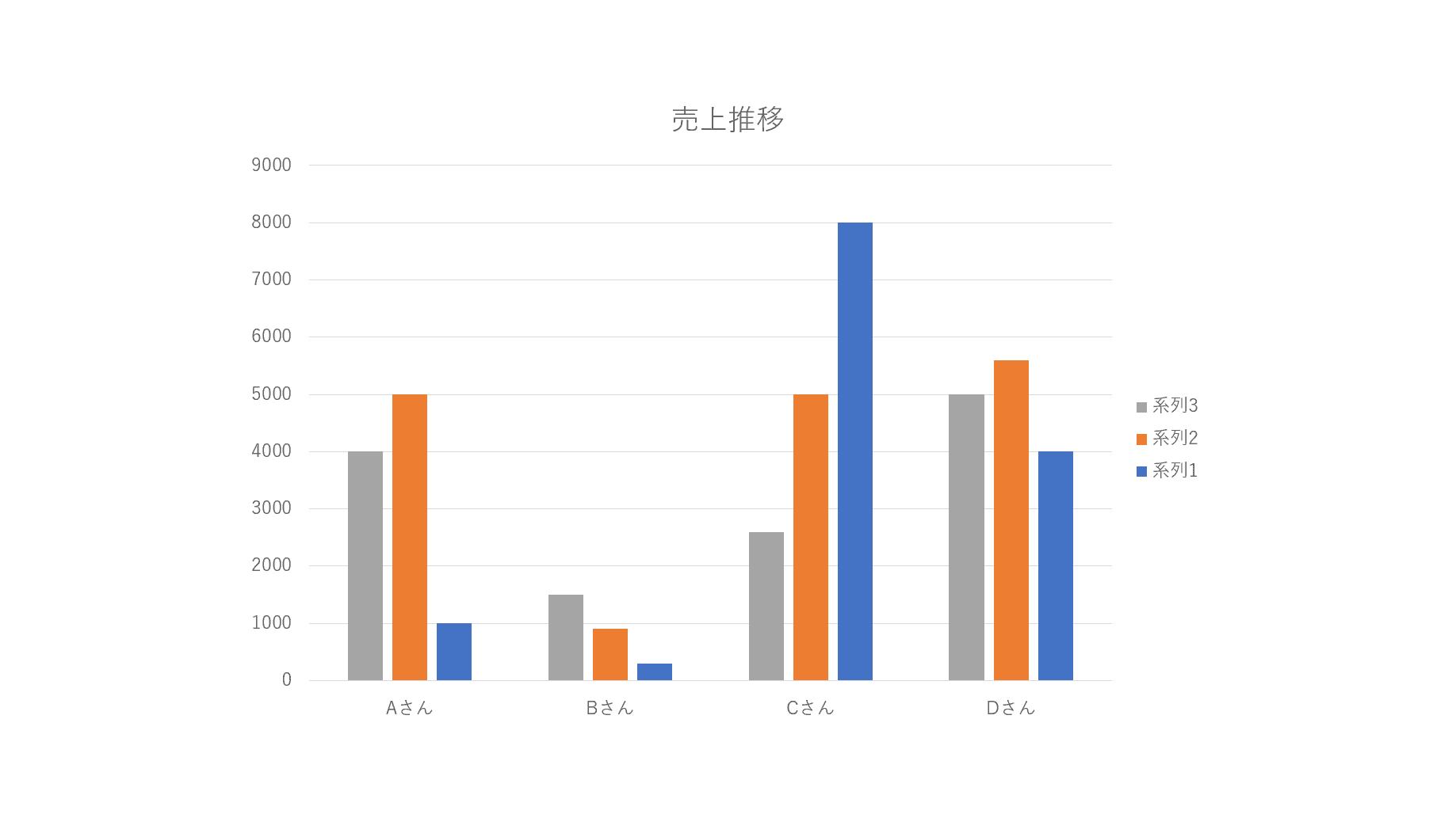
凡例の順番の並び替えができました。
凡例の名前を変更する
グラフを選択し、グラフ右上の①【フィルター】ボタン、②【データの選択】リンクを押します。
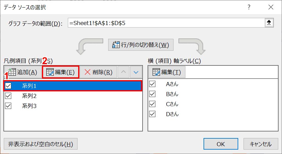
「データソースの選択」ダイアログボックスが表示されました。①【系列1】を選択し、②【編集】ボタンを押します。
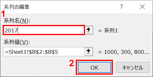
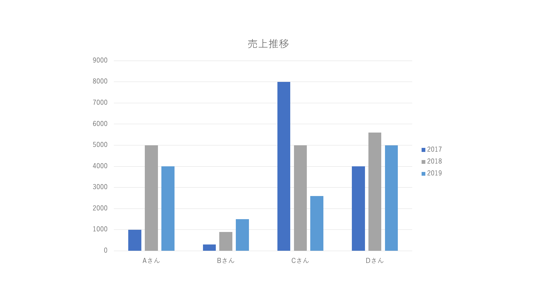
「系列の編集」ダイアログボックスが表示されました。①【系列名】を選択して値を入力し、②【OK】ボタンを押します。今回は「2017」と入力しました。
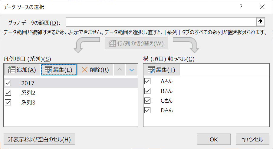
「系列1」が「2017」に変更されました。
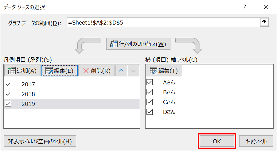
同様に「系列2」と「系列3」もそれぞれ「2018」と「2019」と変更します。完了したら【OK】ボタンを押します。
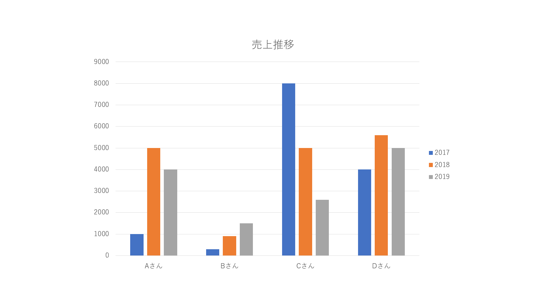
凡例の名前を変更できました。
グラフの単位について
軸に単位を表示・変更する
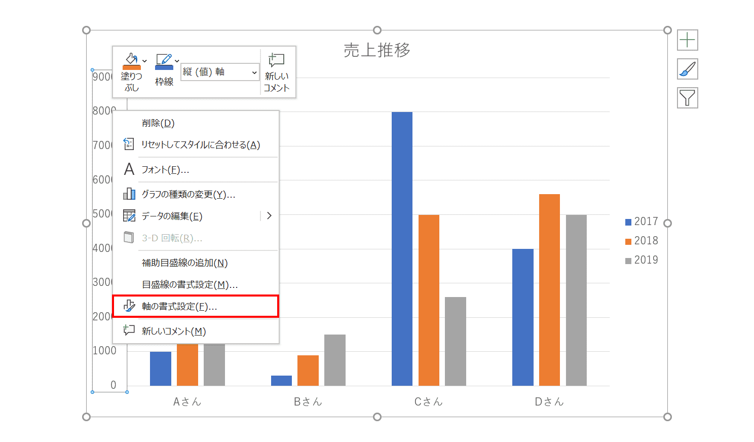
まず縦軸を【右クリック】します。右クリックメニューから【軸の書式設定】を選択します。
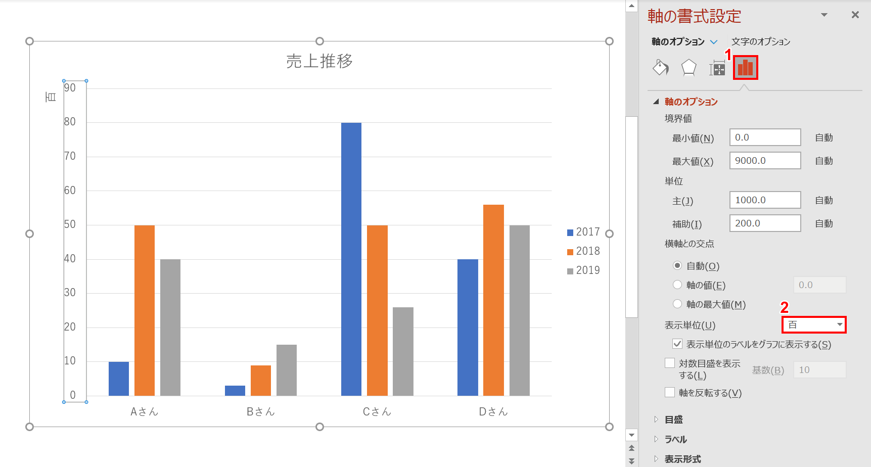
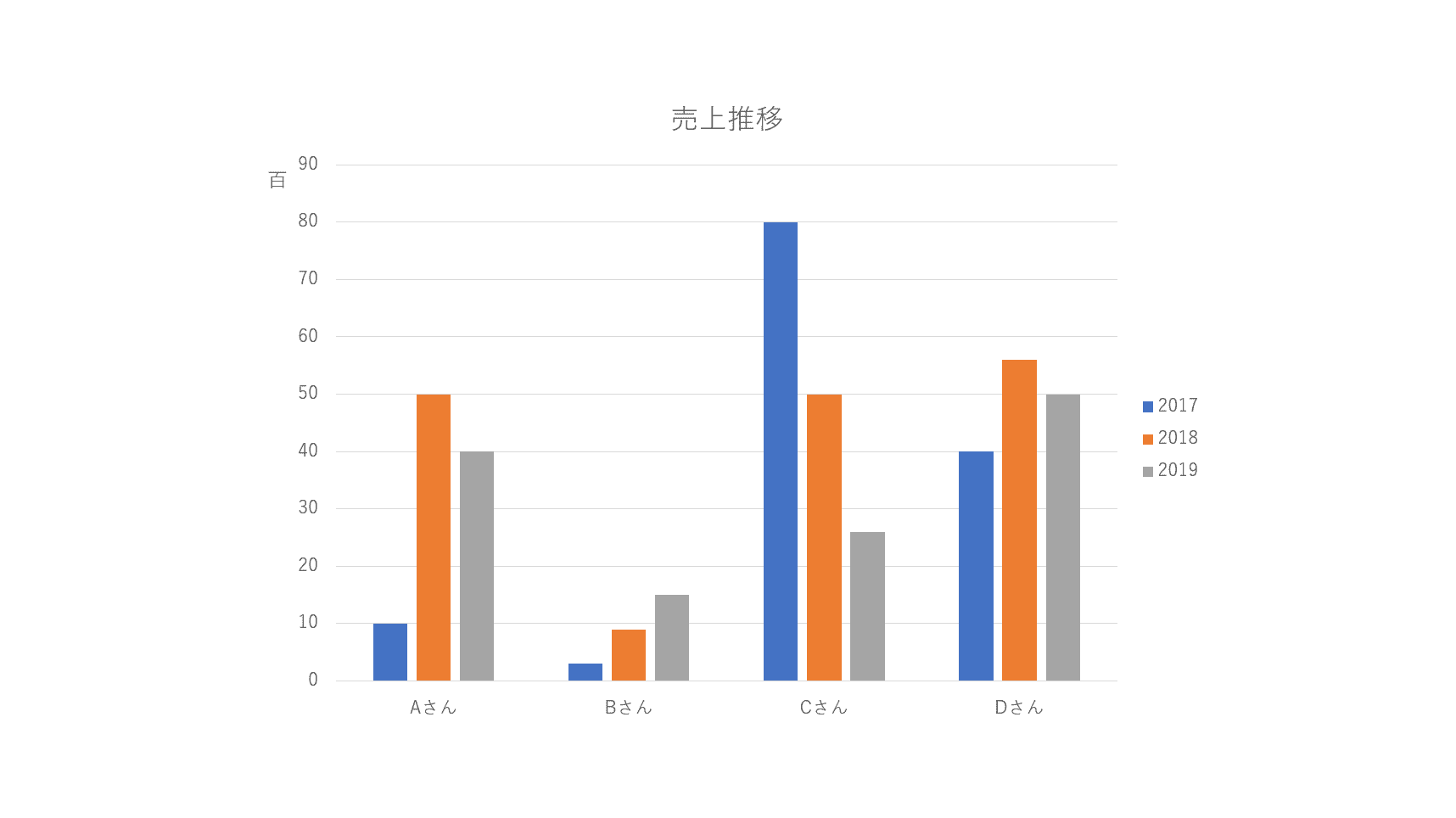
「軸の書式設定」エリアが表示されました。①【軸のオプション】アイコン、②「表示単位」から【百】を選択します。
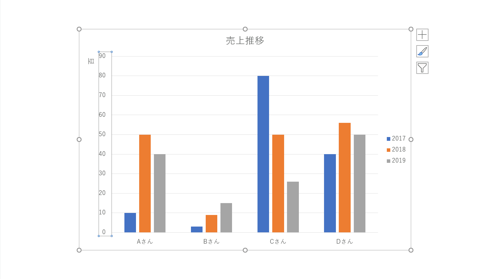
縦軸に「百」が表示されました。
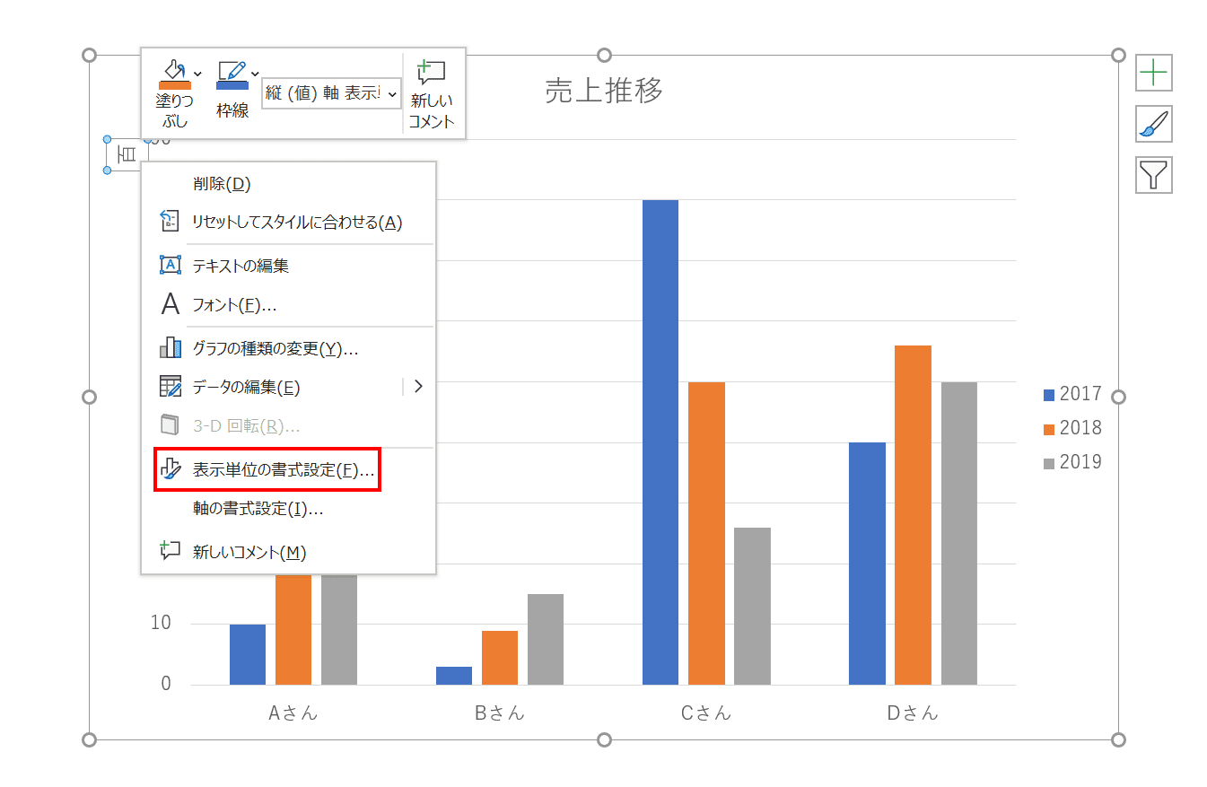
縦書きにする場合は、単位の「百」を【右クリック】し、右クリックメニューから【表示単位の書式設定】を選択します。
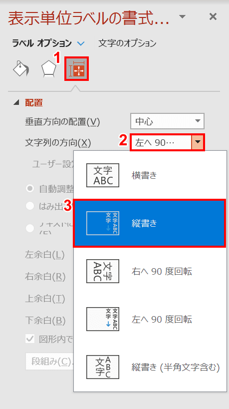
「表示単位の書式設定」エリアが表示されました。①【サイズとプロパティ】アイコンを選択し、②「文字列の方向」を【縦書き】にします。
単位が縦書きになりました。
目盛りを任意にする
グラフを作成すると入力したデータによって自動的に目盛りが設定されます。手動で目盛りを変更する方法をご紹介します。
縦軸を【右クリック】し、右クリックメニューの【軸の書式設定】を選択します。
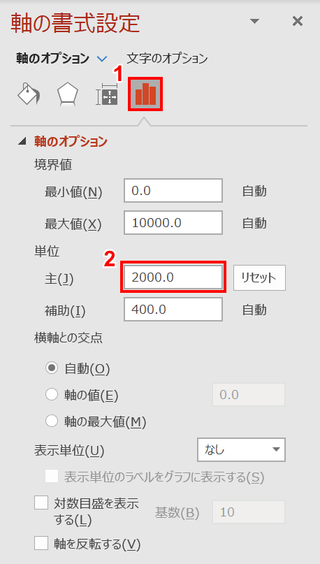
「軸の書式設定」エリアが表示されました。①【軸のオプション】アイコンを選択し、②「単位」の下にある「主」に任意の値を入力します。今回は「2000.0」と入力しました。ここが目盛りの単位を設定する項目になります。
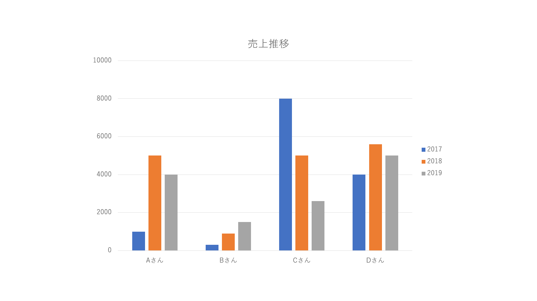
目盛りの単位を2000に変更することができました。
目盛り線の追加
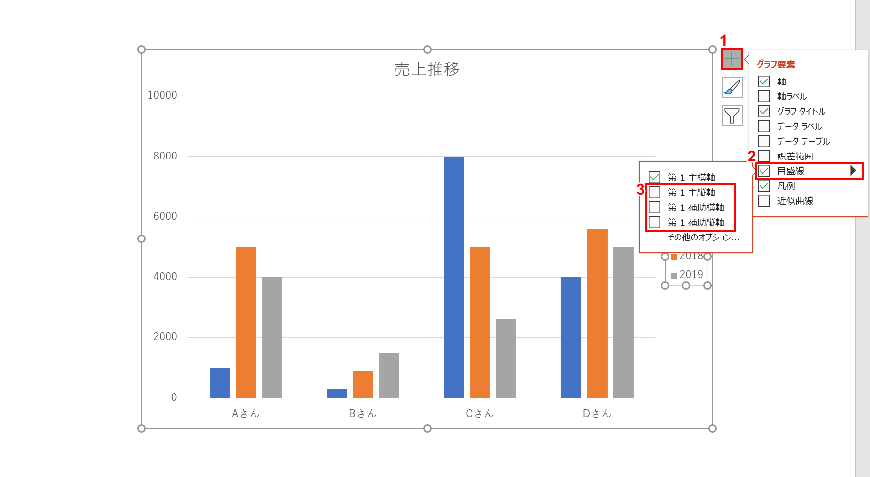
棒グラフの場合、通常は横軸の目盛り線のみが表示されています。ここに縦や補助線を追加していきます。
グラフを選択し、①グラフ右上の【+】ボタンを押し、②「グラフ要素」メニューから【目盛線】、③「第1主縦軸」④「第1補助横軸」⑤「第1補助縦軸」にそれぞれチェックをつけます。
グラフの目盛り線に縦軸と補助線が追加できました。
小数点桁数を変更する
縦軸を【右クリック】し、【軸の書式設定】を選択します。
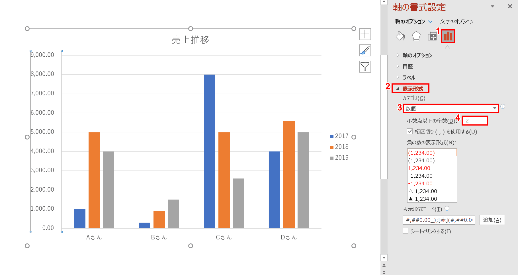
「軸の書式設定」エリアが表示されました。①【軸のオプション】アイコン、②【表示形式】、③「カテゴリ」で【数値】の順に選択して④「小数点以下の桁数」に【任意の値】を入力します。今回は「2」と入力しました。縦軸の単位に小数点桁数が表示されました。
グラフの色分けについて
凡例の色を変更する
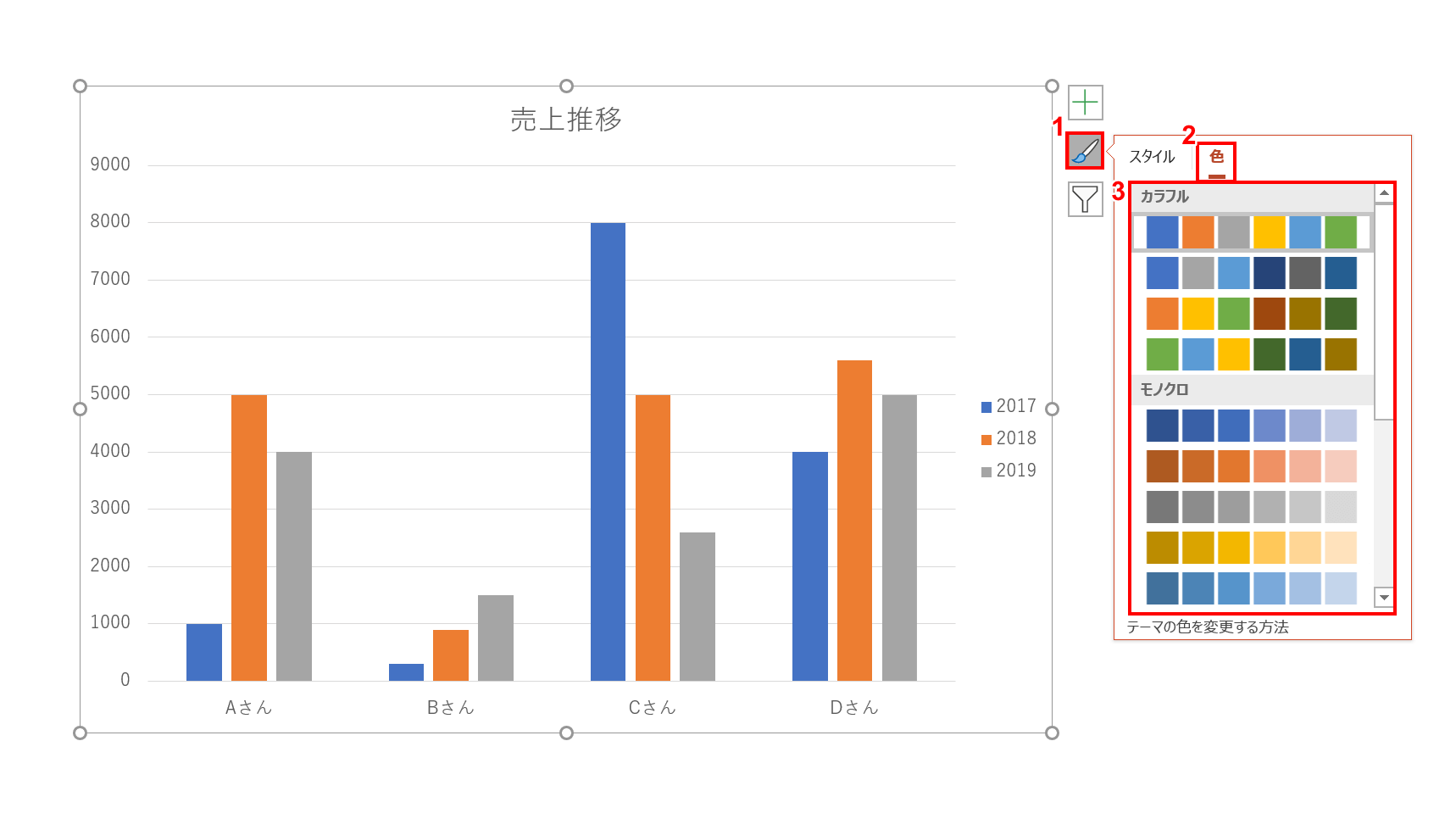
グラフを選択し、グラフ右上の①【スタイル】ボタン、②【色】タブ、③【任意の色のパターン】を選択します。今回は「カラフルなパレット2」を選択しました。
グラフの凡例の色を変更することができました。
折れ線の色分け
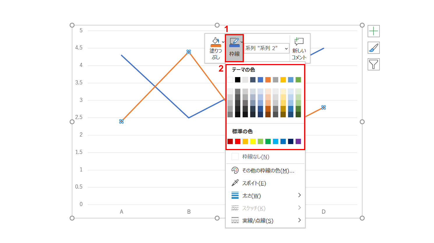
色を変更したいの系列を【右クリック】し、右クリックメニューの①【枠線】、②【任意の色】の順に選択します。今回は「緑、アクセント 6」を選択しました。
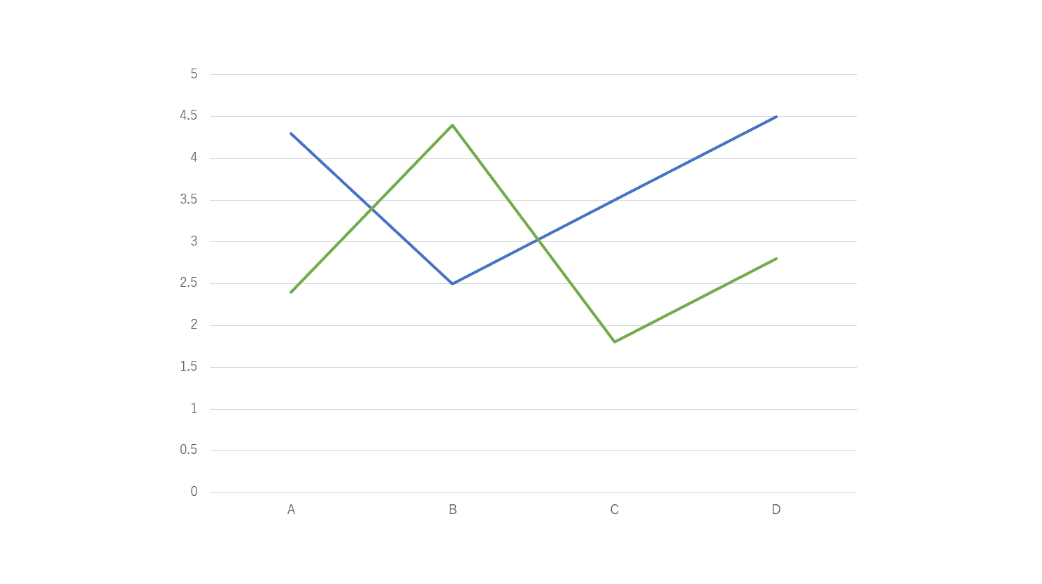
折れ線グラフの系列の色を変更することができました。
棒グラフの色分け
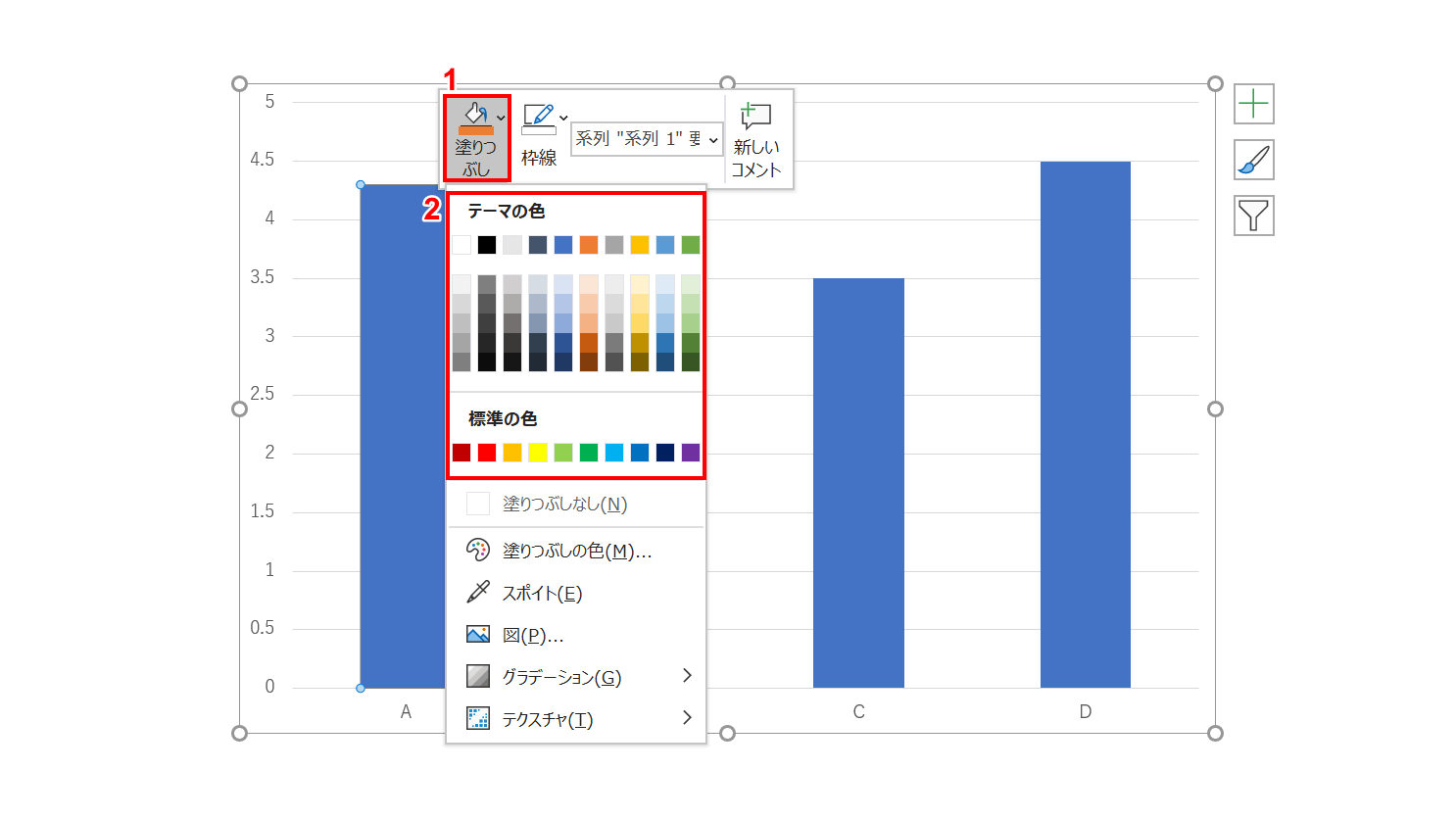
色を変更したい系列を【右クリック】し、右クリックメニューの①【塗りつぶし】、②【任意の色】の順に選択します。今回は「オレンジ、アクセント 2」を選択しました。
色を変更することができました。
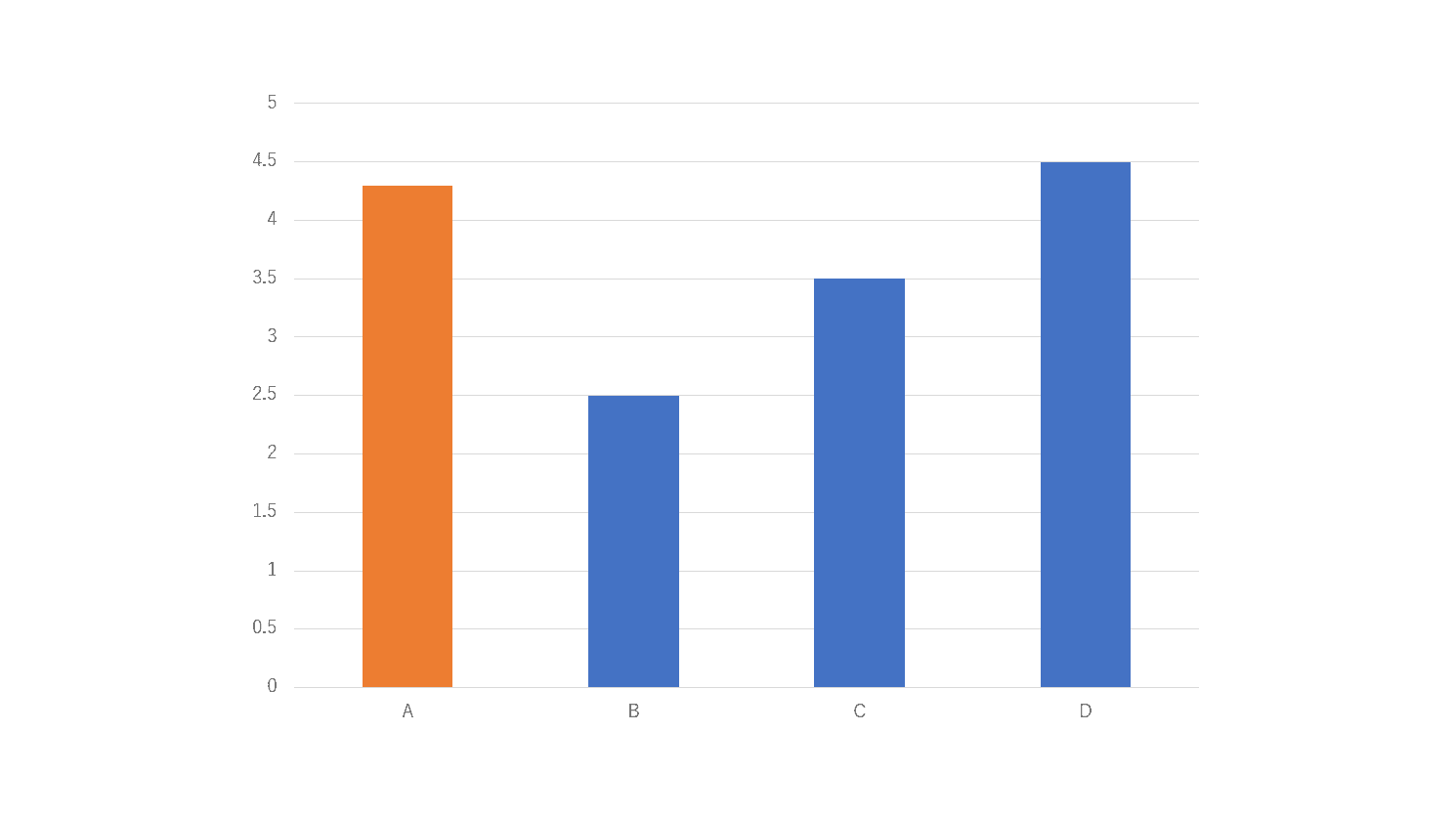
数値を表示する(データラベル)
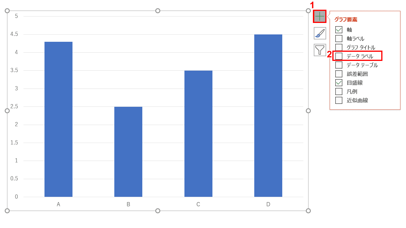
グラフを選択し、グラフ右上の①【+】ボタン、②【データラベル】の順に選択します。
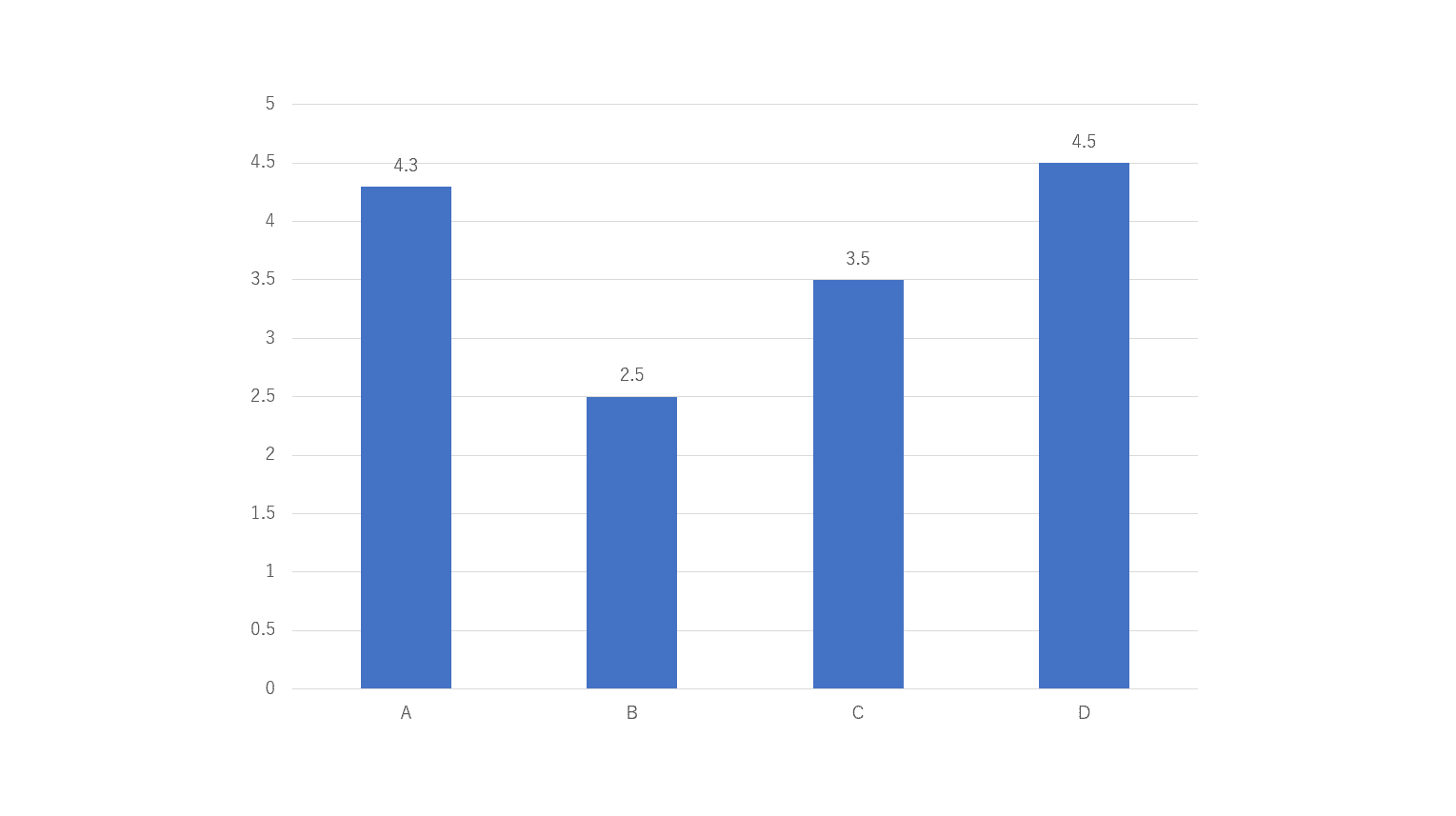
系列の数値が表示されました。
グラフのデザインを変更する
スタイルを変更する
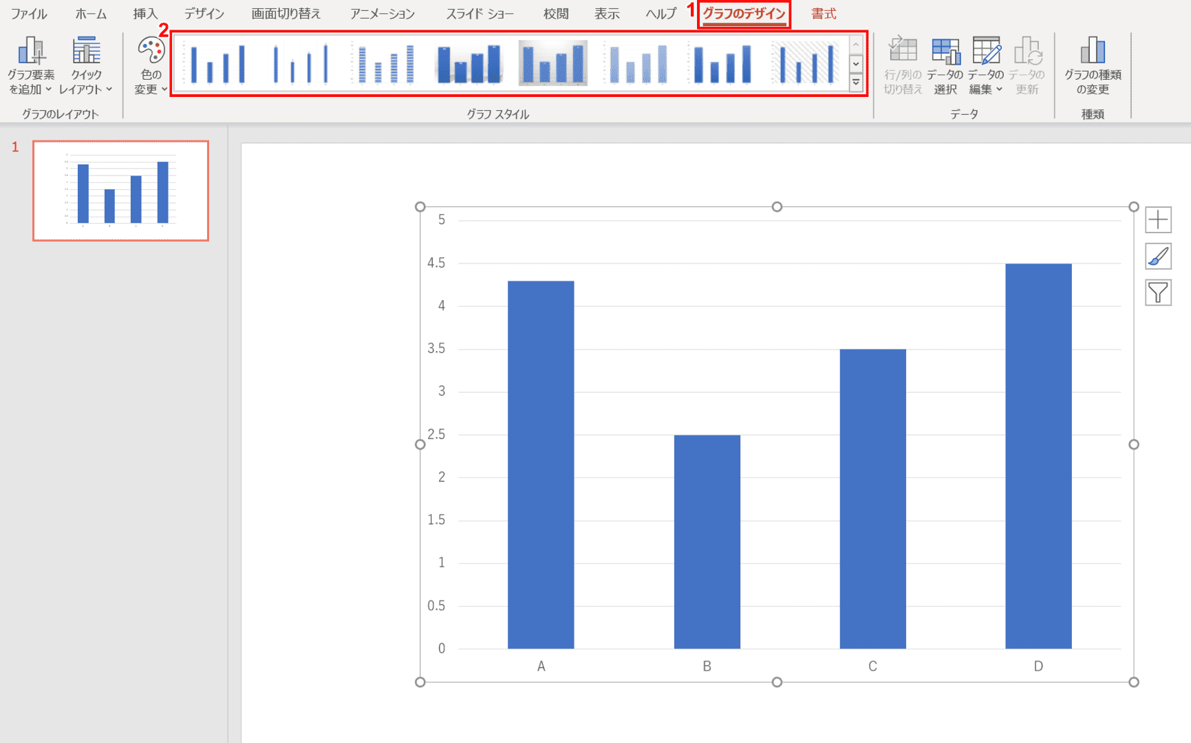
グラフのスタイルを変更したい場合は、①リボンの【グラフのデザイン】タブ、②【任意のスタイル】の順に選択します。今回は「スタイル7」を選択します。
グラフのスタイルが変更されました。
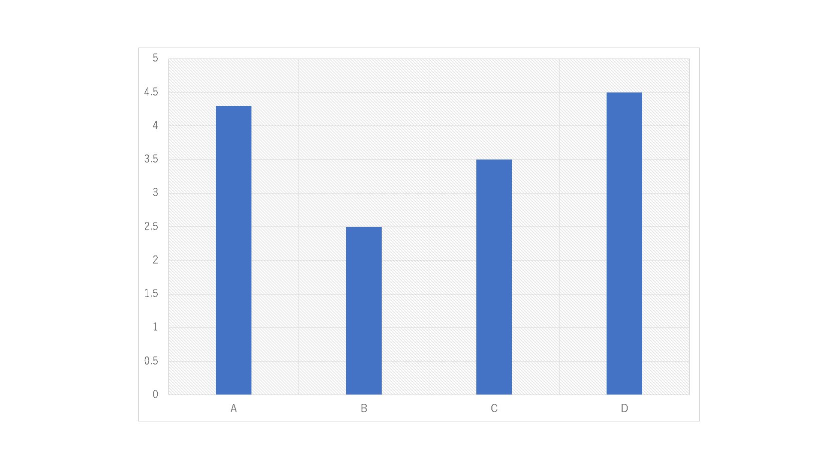
種類を変更する
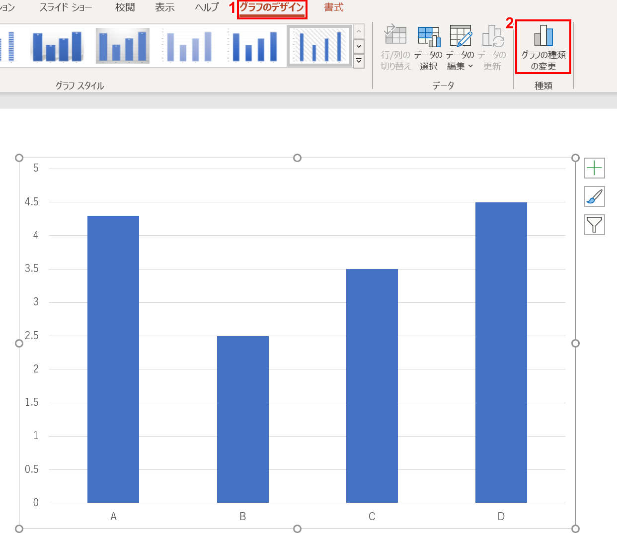
グラフの種類を変更したい場合は、①リボンの【グラフのデザイン】タブ、②【グラフの種類の変更】の順に選択します。
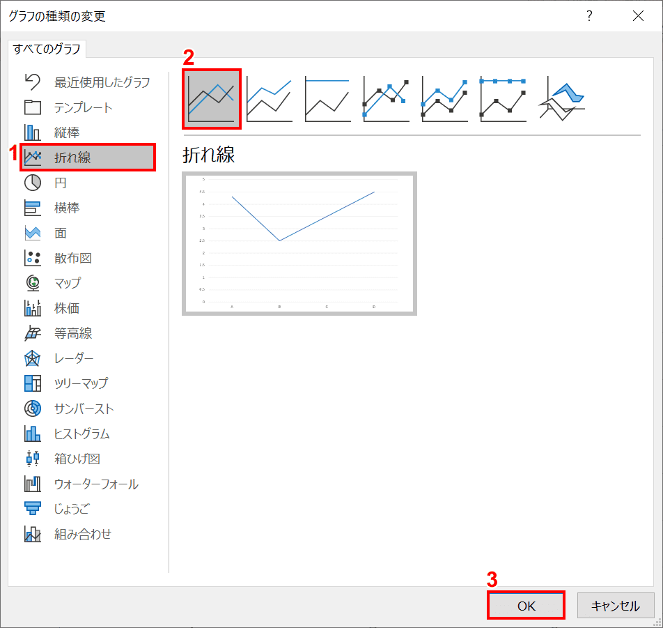
「グラフの種類の変更」ダイアログボックスが表示されました。①【任意のグラフの種類】、② 【任意のグラフのスタイル】、③【OK】ボタンの順に押します。今回は「折れ線」を選択しました。
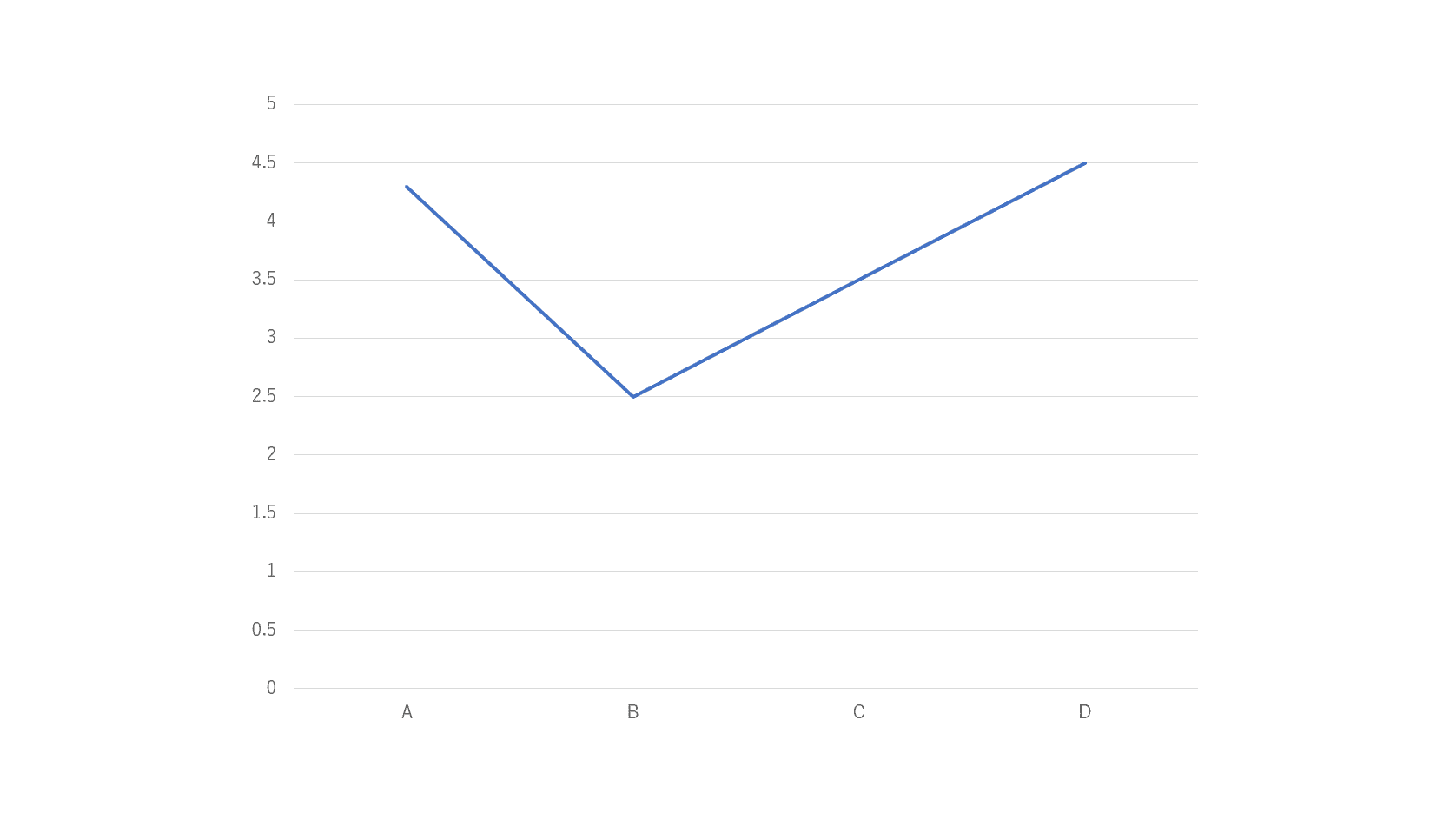
グラフの種類が変更されました。
区分線を表示する
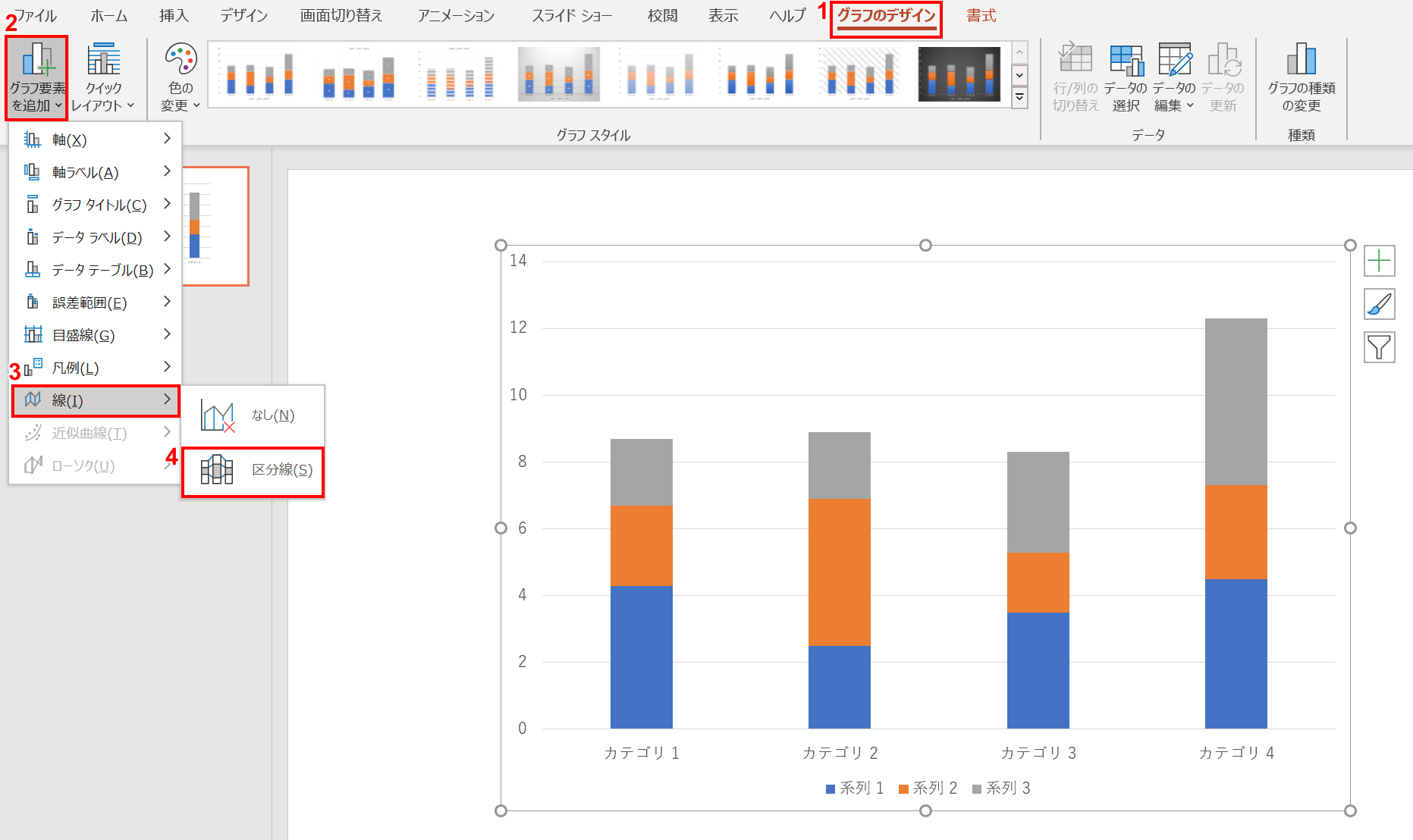
区分線を表示する場合は、①リボンの【グラフのデザイン】タブ、②【グラフの要素を追加】、③【線】、④【区分線】の順に選択します。
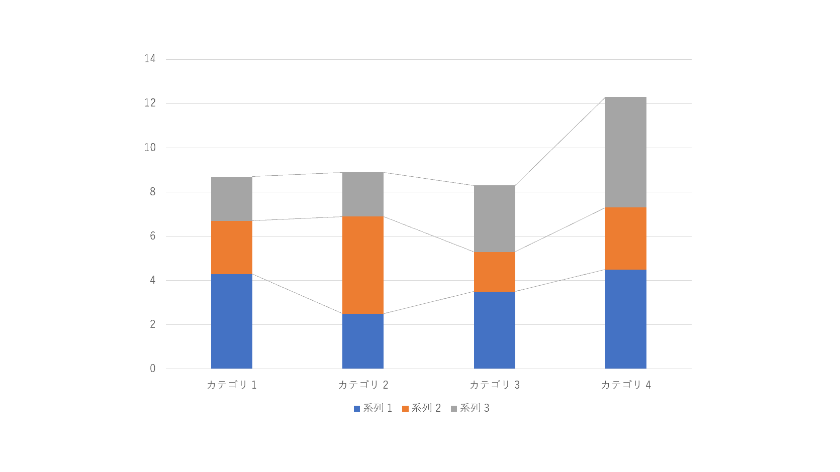
区分線が表示されました。
文字を追加する
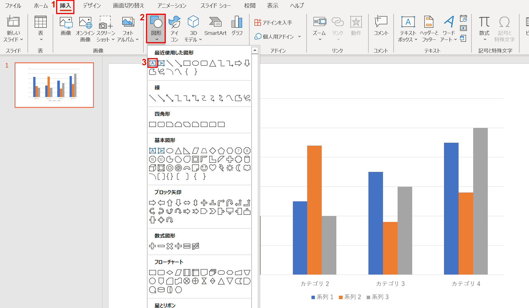
グラフに内に文字を追加したい場合は、「テキストボックス」を使います。①リボンの【挿入】タブ、②【図形】、③【テキストボックス】の順に選択します。
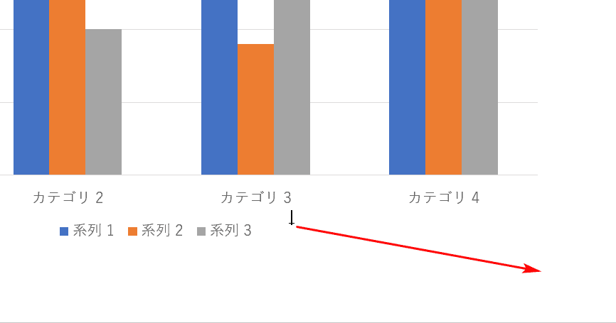
ポインタが「+」になったら、任意の大きさまでドラッグし、テキストボックスを挿入します。
文字を入力すれば完了です。
アニメーションを追加する
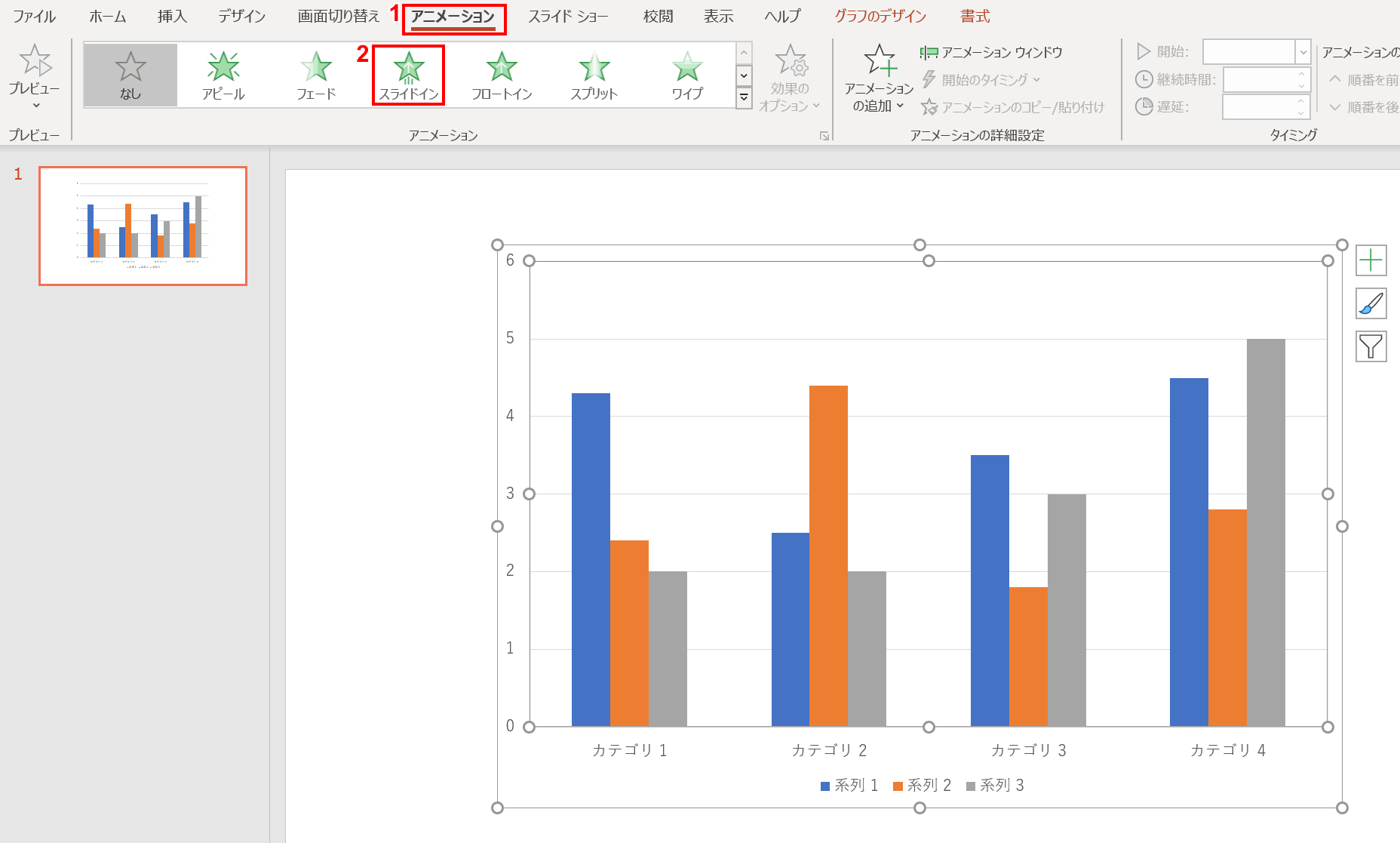
アニメーションを追加したい場合は、グラフを選択し、①リボンの【アニメーション】タブ、②【任意のアニメーション】の順に選択します。今回は「スライドイン」を選択しました。
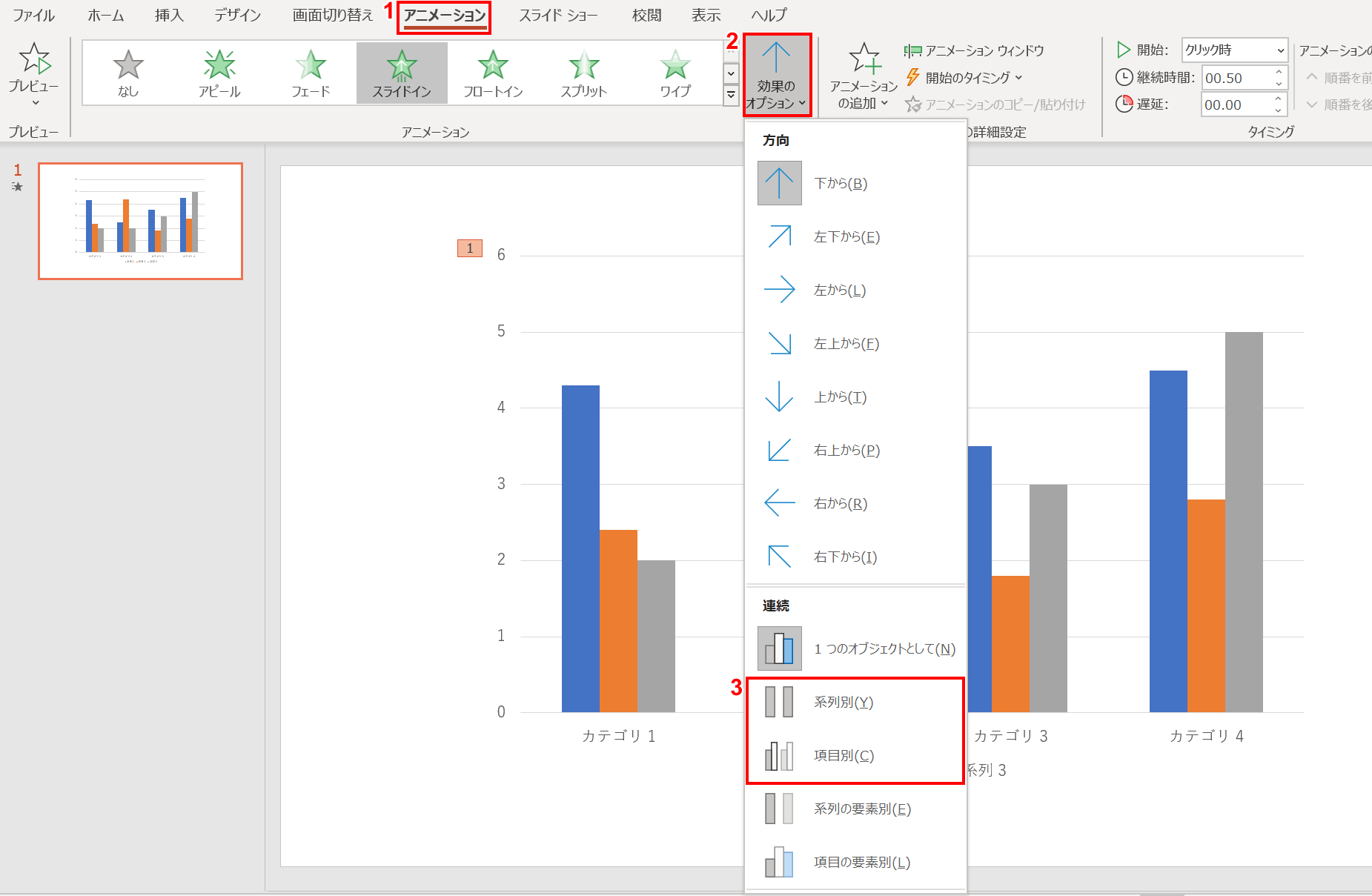
これでアニメーションは追加されましたが、グラフが一つのオブジェクトとしてアニメーションが設定されています。系列や項目別にアニメーションを設定する場合は、①リボンの【アニメーション】タブ、②【効果のオプション】、③【系列別】もしくは【項目別】の順に選択します。
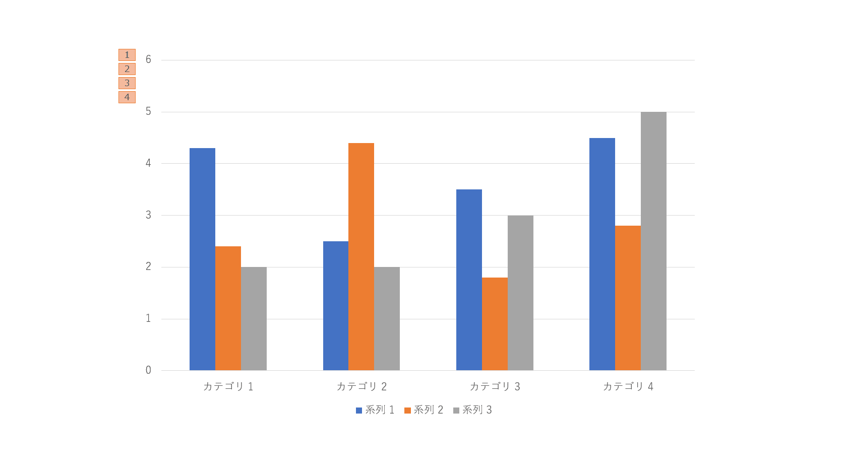
系列別もしくは項目別にアニメーションが設定されました。
テンプレートとして保存する
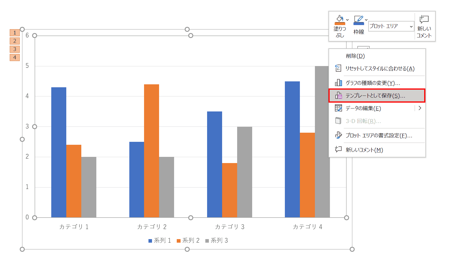
グラフ上で【右クリック】し、右クリックメニューから【テンプレートとして保存】を選択します。
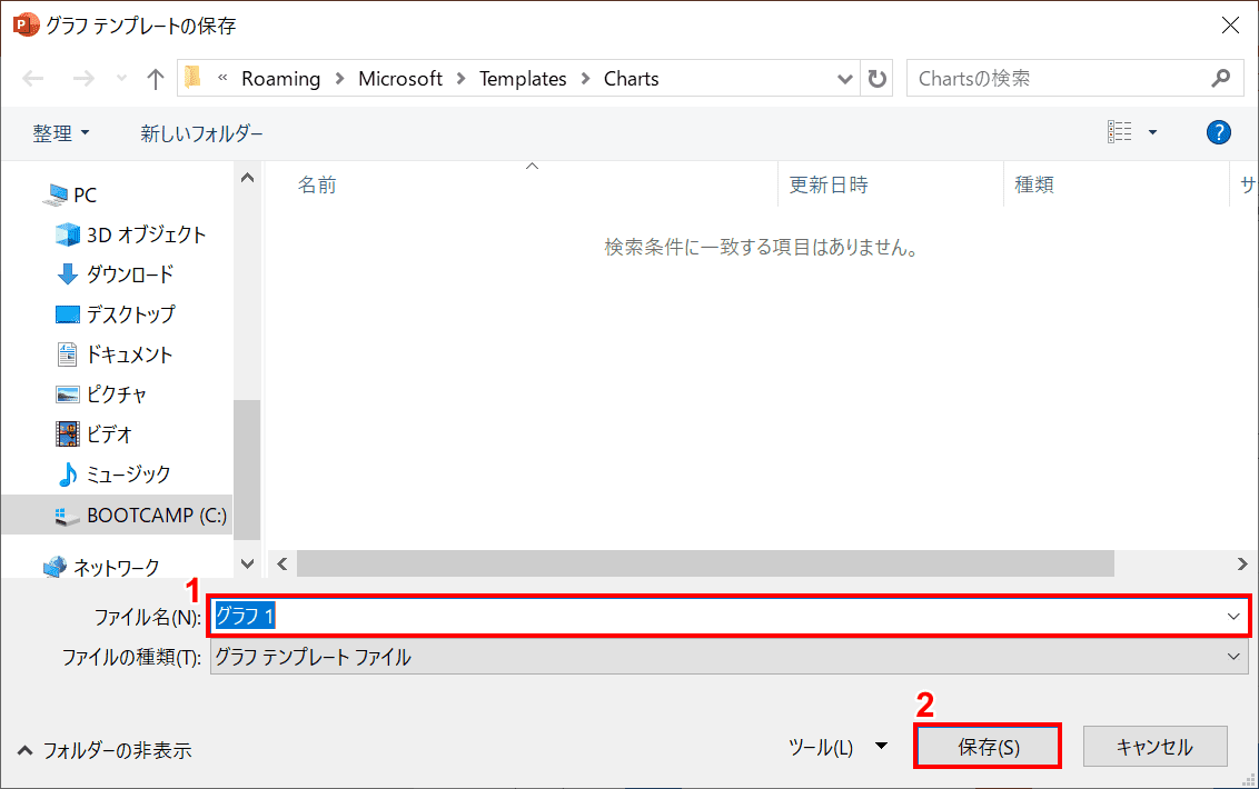
「グラフテンプレートの保存」ダイアログボックスが表示されました。①ファイル名に【任意の名前】を入力し、②【保存】を押します。これで保存されました。
グラフを挿入する場合は、①リボンの【挿入】タブ、②【グラフ】の順に選択します。
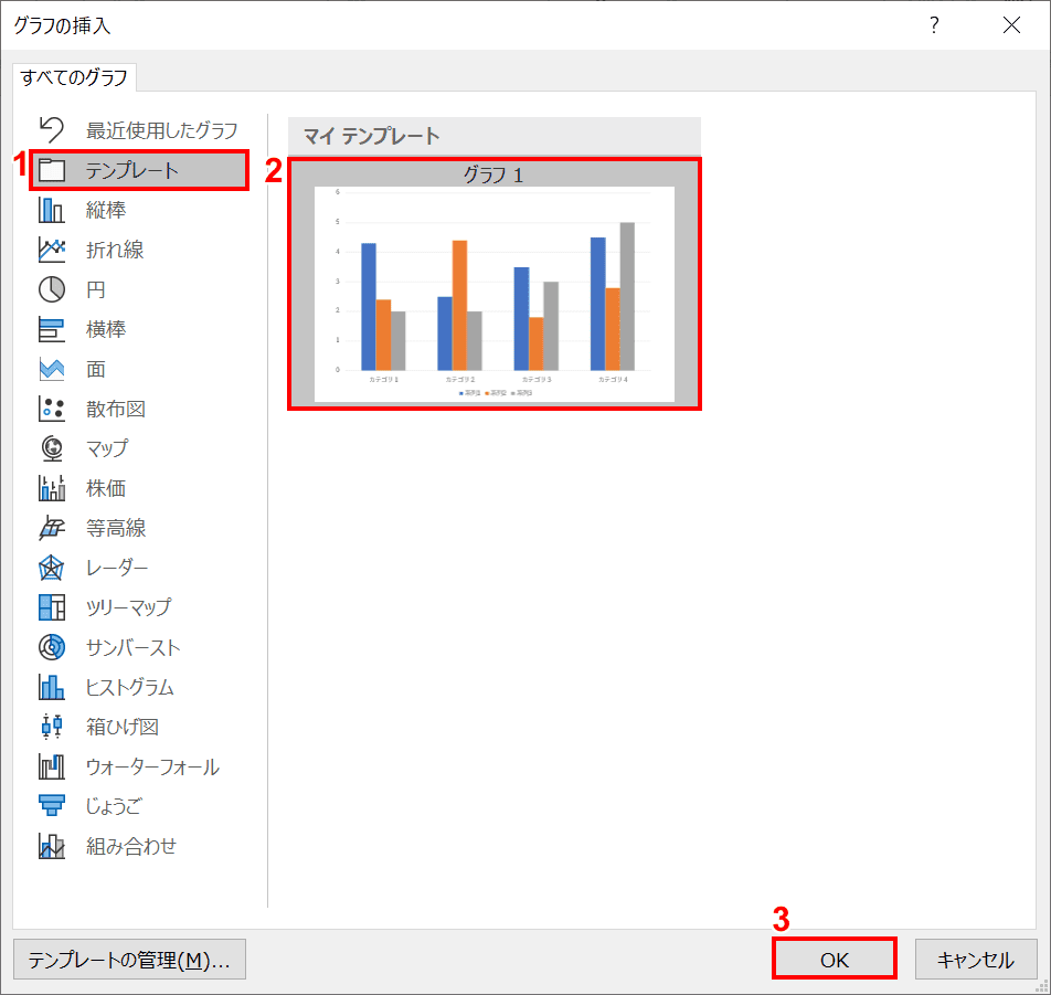
「グラフの挿入」ダイアログボックスが表示されました。①【テンプレート】、②【任意のグラフ】、③【OK】ボタンの順に押します。
テンプレートとして保存したグラフが挿入されました。
エクセルで作成したグラフを挿入する方法
貼り付けする
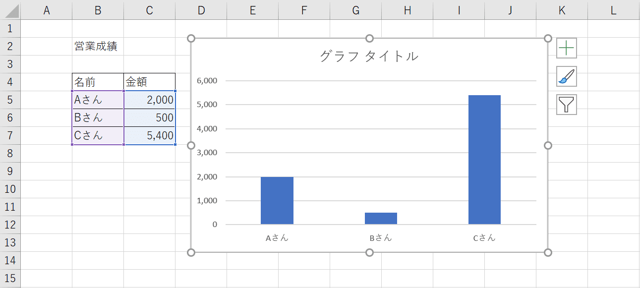
エクセルの画面でエクセルで作成したグラフを選択し、Ctrl+Cを押しコピーします。
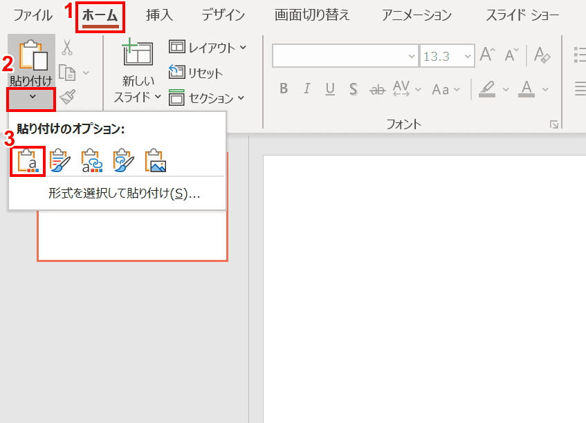
次にパワーポイントファイルのグラフを貼り付けたいスライドを表示します。①リボンの【ホーム】タブ、②【貼り付けの下の▼】、③【貼り付け先テーマを使用しデータを埋め込む】の順に押します。
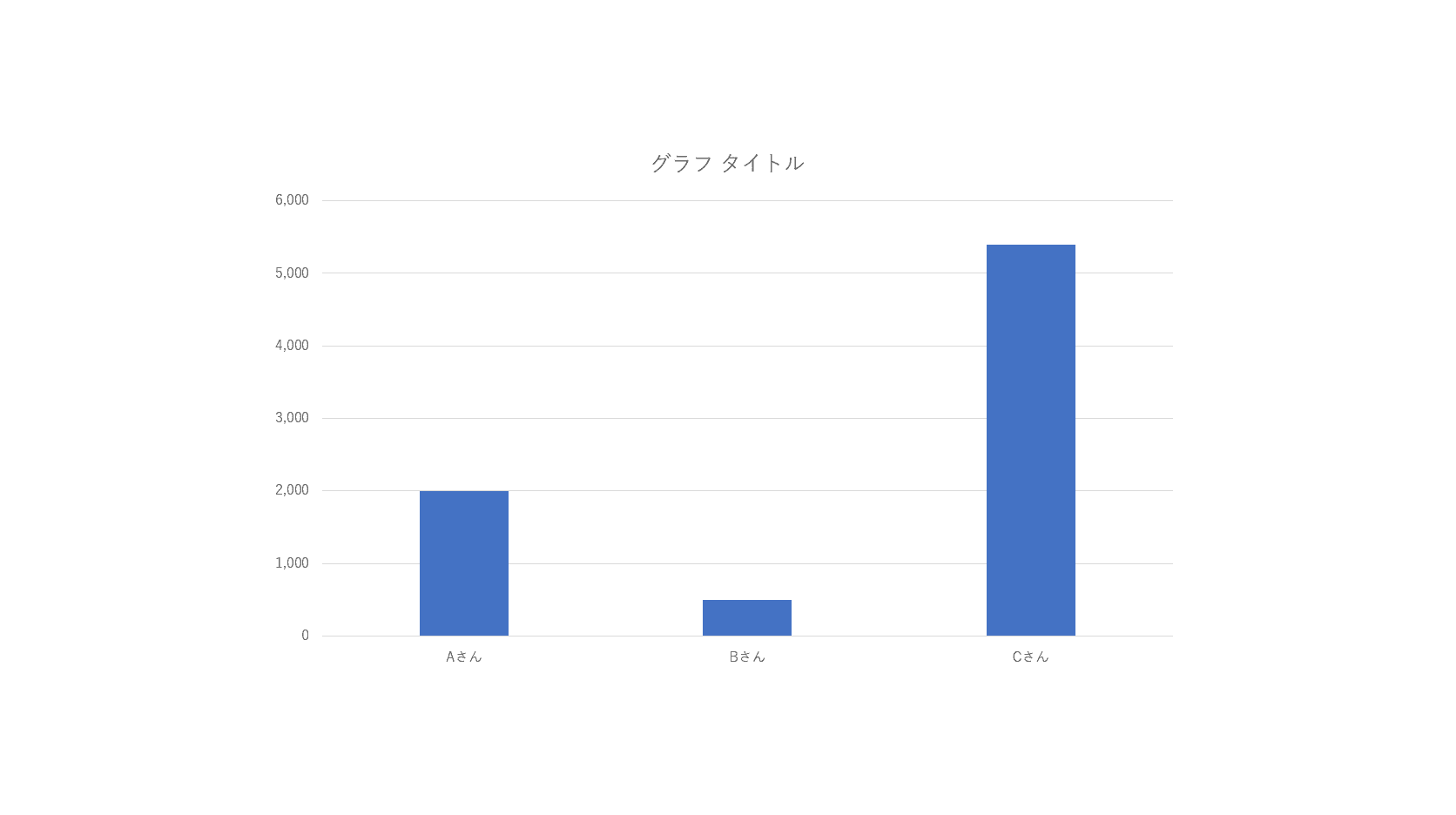
貼り付けが完了しました。この貼り付け方法を使用した場合、エクセルのデータを編集してもパワーポイントのグラフには反映されません。
表と連動させる
エクセルの表のデータとパワーポイントのグラフを連動させ、エクセルのデータを更新するとパワーポイントのグラフに自動的に反映させることも可能です。その場合は、エクセルの画面上で作成したグラフを選択し、Ctrl+Cを押しコピーします。
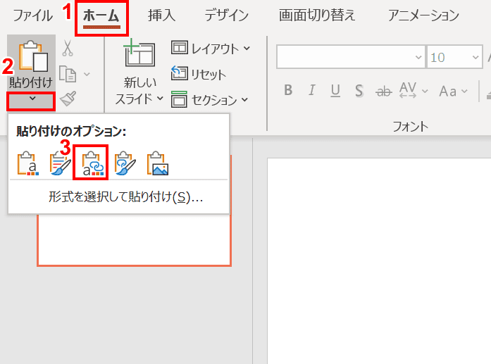
次にパワーポイントファイルのグラフを貼り付けたいスライドを表示します。①リボンの【ホーム】タブ、②【貼り付けの下の▼】、③【貼り付け先テーマを使用しデータをリンク】の順に押します。
貼り付けが完了しました。この貼り付け方法を使用した場合、エクセルのデータを編集するとパワーポイントのグラフにも反映されます。
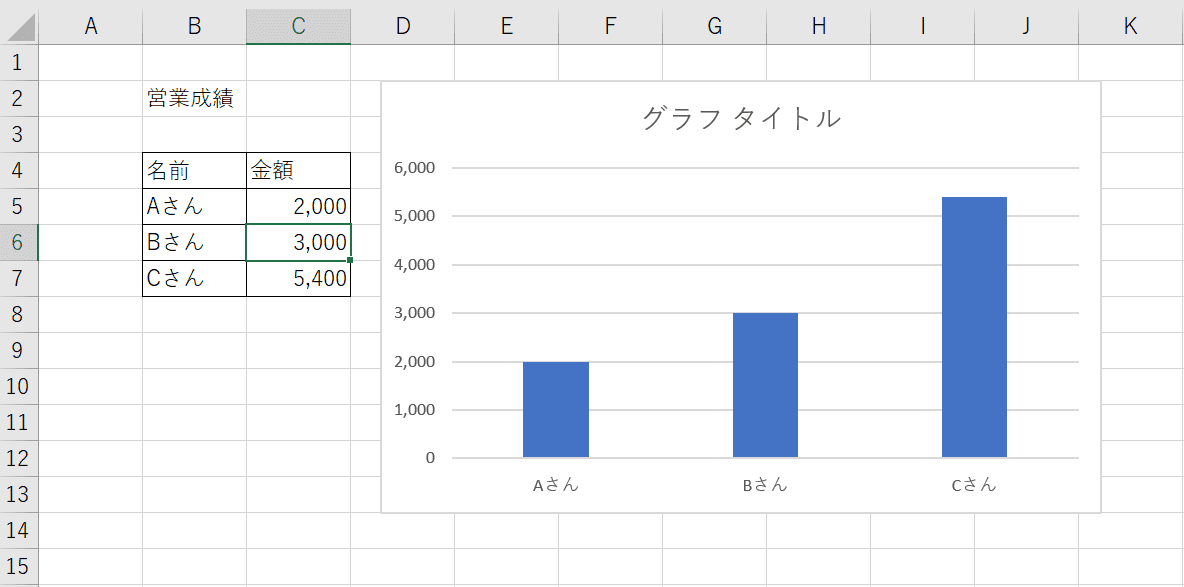
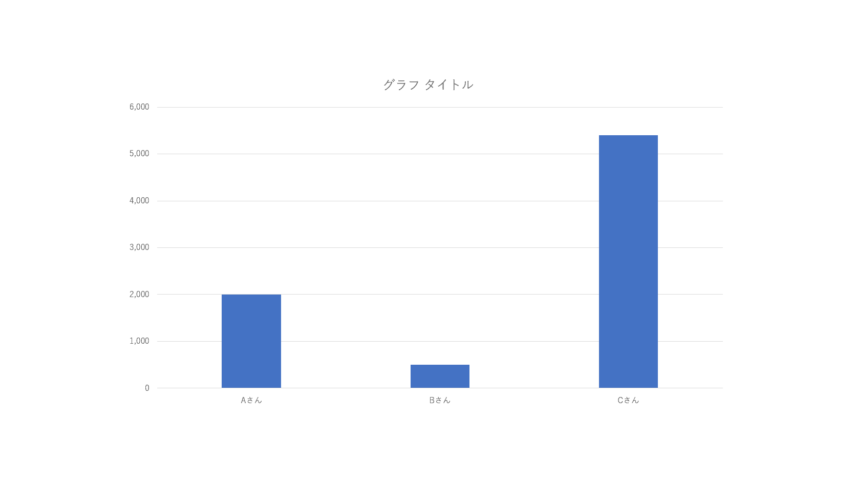
エクセルの画面でデータを編集します。今回はBさんの数値を「3000」に変更しました。
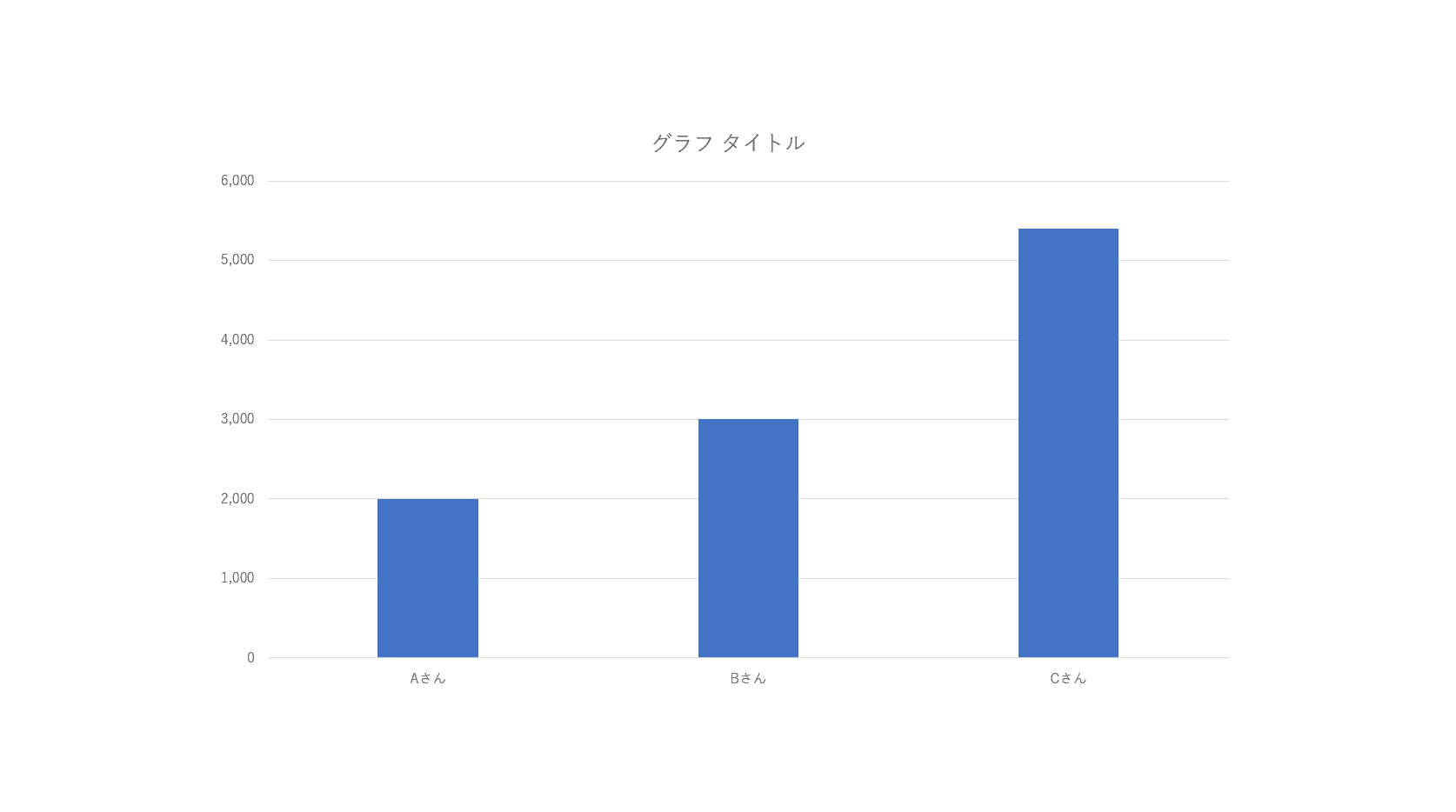
パワーポイントのグラフにも反映されました。
データの更新について
更新方法
エクセルファイルとパワーポイントファイルの両方を開いている状態でエクセルのデータを更新すると、パワーポイントのグラフにも更新内容が自動的に反映されます。
エクセルデータを編集したい場合は、グラフを選択し、①リボンの【デザイン】タブ、②【データの編集】、③【Excelでデータを編集】の順に選択します。
エクセルファイルが開きました。この画面で表の内容を更新します。今回はBさんの数値を「3000」に変更しました。
パワーポイントのグラフにも更新内容が反映されました。
更新されないとき
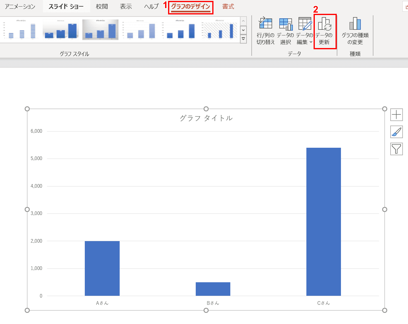
エクセルファイルの内容を更新してもパワーポイントのグラフに更新内容が反映されないことがあります。その場合は、パワーポイントのグラフを選択し、①リボンの【グラフのデザイン】タブ、②【データの更新】の順に選択します。
データが更新されました。
リンク解除の方法
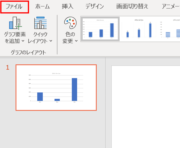
エクセルファイルとのリンクを解除したい場合は、リボンの【ファイル】タブを選択します。
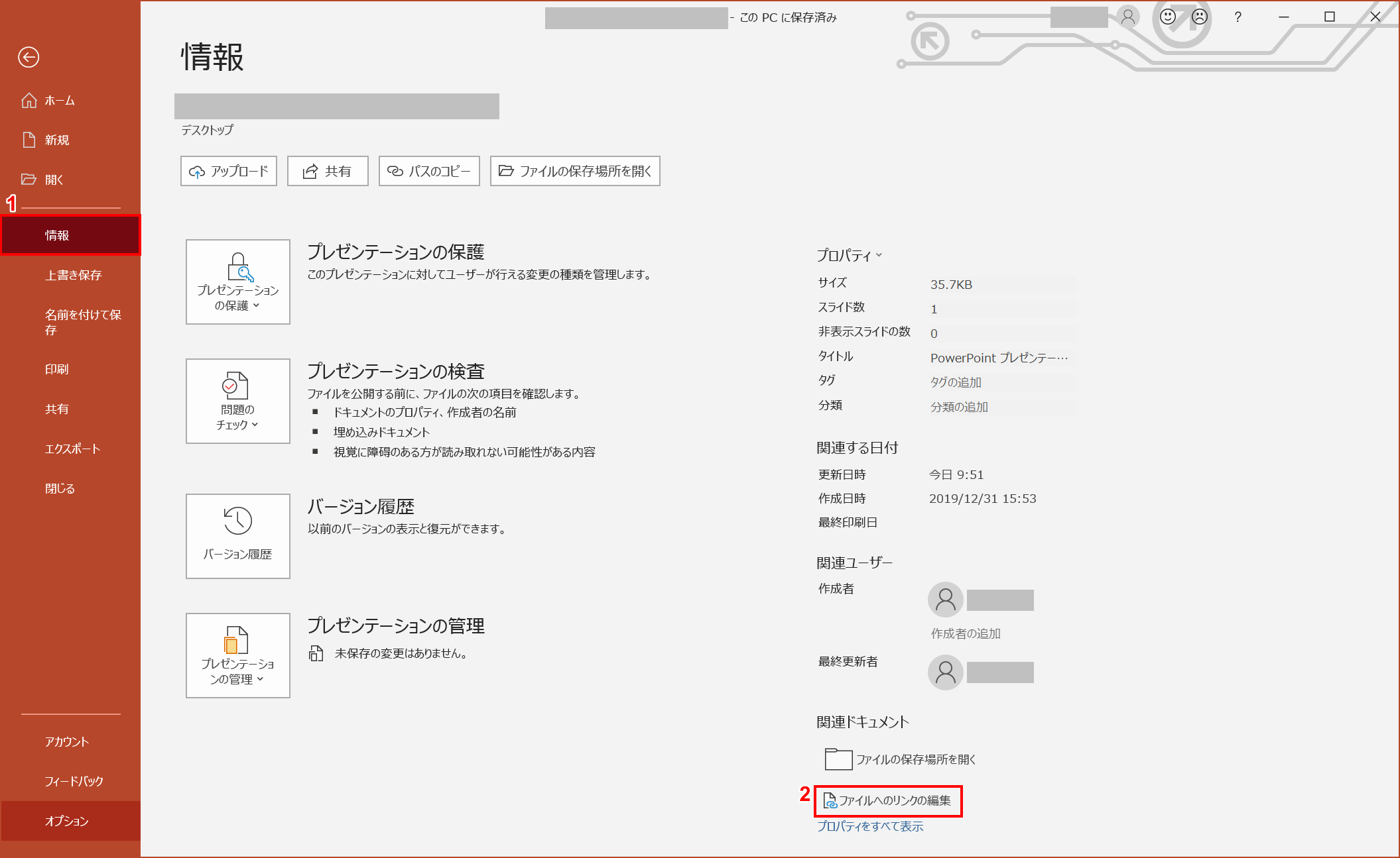
次に、①【情報】、②【ファイルへのリンクの編集】の順に押します。
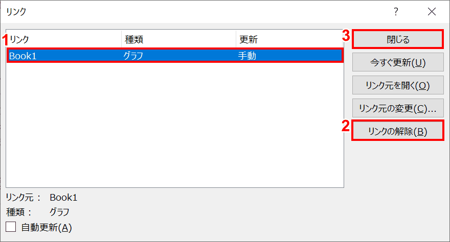
「リンク」ダイアログボックスが表示されました。①解除したいグラフのリンクを選択し、②【リンクの解除】、③【閉じる】の順に押します。
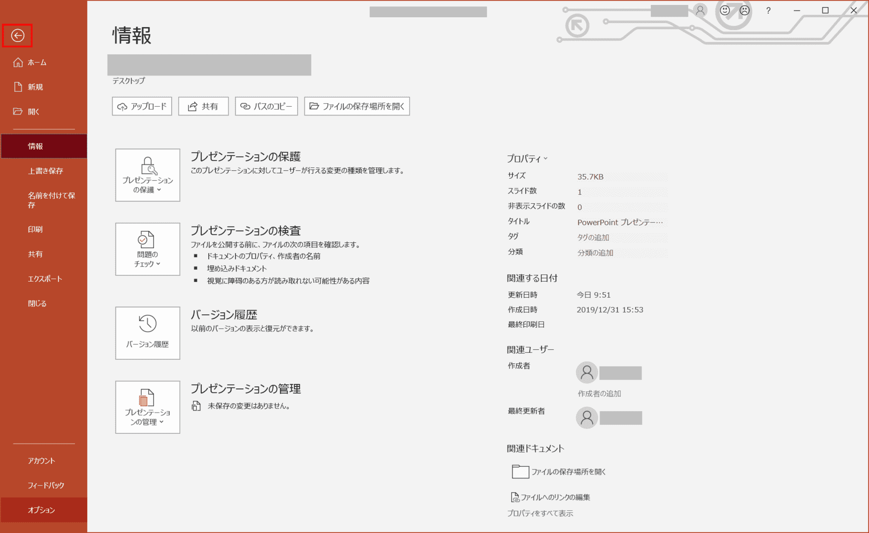
先ほどの画面に戻りました。左上の【←】を押し、スライドの編集画面に戻ります。
これでエクセルファイルとのリンクが解除されました。この後エクセルファイルを編集してもパワーポイントのグラフに更新内容が反映されることはありません。